Queers in Property Refresh
Back to our ProjectsClient
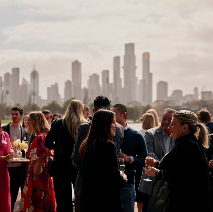
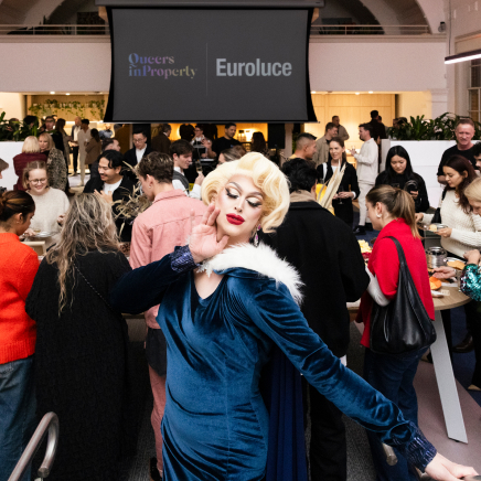
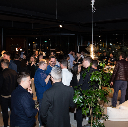
Queers in Property
Sector
Not for Profit, Property
Location
Melbourne, VIC
Year
2024
Brief
Our task was to refresh the Queers in Property brand and launch a new website that reflects its role as a vibrant, professional network for LGBTQIA+ people in the property and construction industry.
Scope of works
- Brand Refresh
- Website Design
- Creative Strategy
- Art Direction
- Digital Design
- Print Design
- Graphic Design
- Animation

Solution
We developed a bold yet minimal visual identity, anchored by an electrified Pride gradient expanded with hues from multiple LGBTQIA+ flags — a dynamic system that embodies diversity, movement, and intersectionality. Paired with sophisticated editorial serif typography, the design balances energy with professionalism. Gradients are used exclusively in backgrounds to ensure clarity and accessibility, while fluid motion and adaptable layouts extend seamlessly from print to digital. The new website builds on this system, creating a clear, inclusive, and engaging platform for QIP’s community, events, and initiatives. Together, the refreshed brand and website position QIP as timeless yet progressive — a network that celebrates pride all year round.

TEAM
-
Client
Queers In Property
-
Branding
Studio White Noise (obviously)
Lauren Messina
Dawn Liu
Ross Karabelas
-
Web Developer
efront