Property Unites
Back to our ProjectsClient
Property Unites
Sector
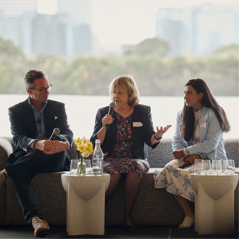
Events, Not for Profit, Property
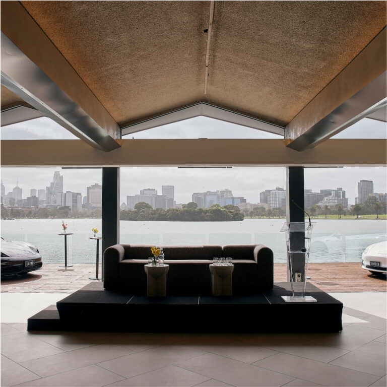
Location
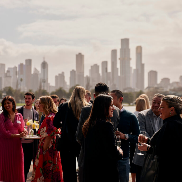
Melbourne, VIC
Year
2023
Brief
We were asked to create a brand identity for a collective of property groups in Melbourne, joining forces to support the most vulnerable Melburnians and most in need.
Scope of works
- Brand Identity
- Campaign Direction
- Art Direction
- Digital Design
- Creative Strategy
- Graphic Design
Solution
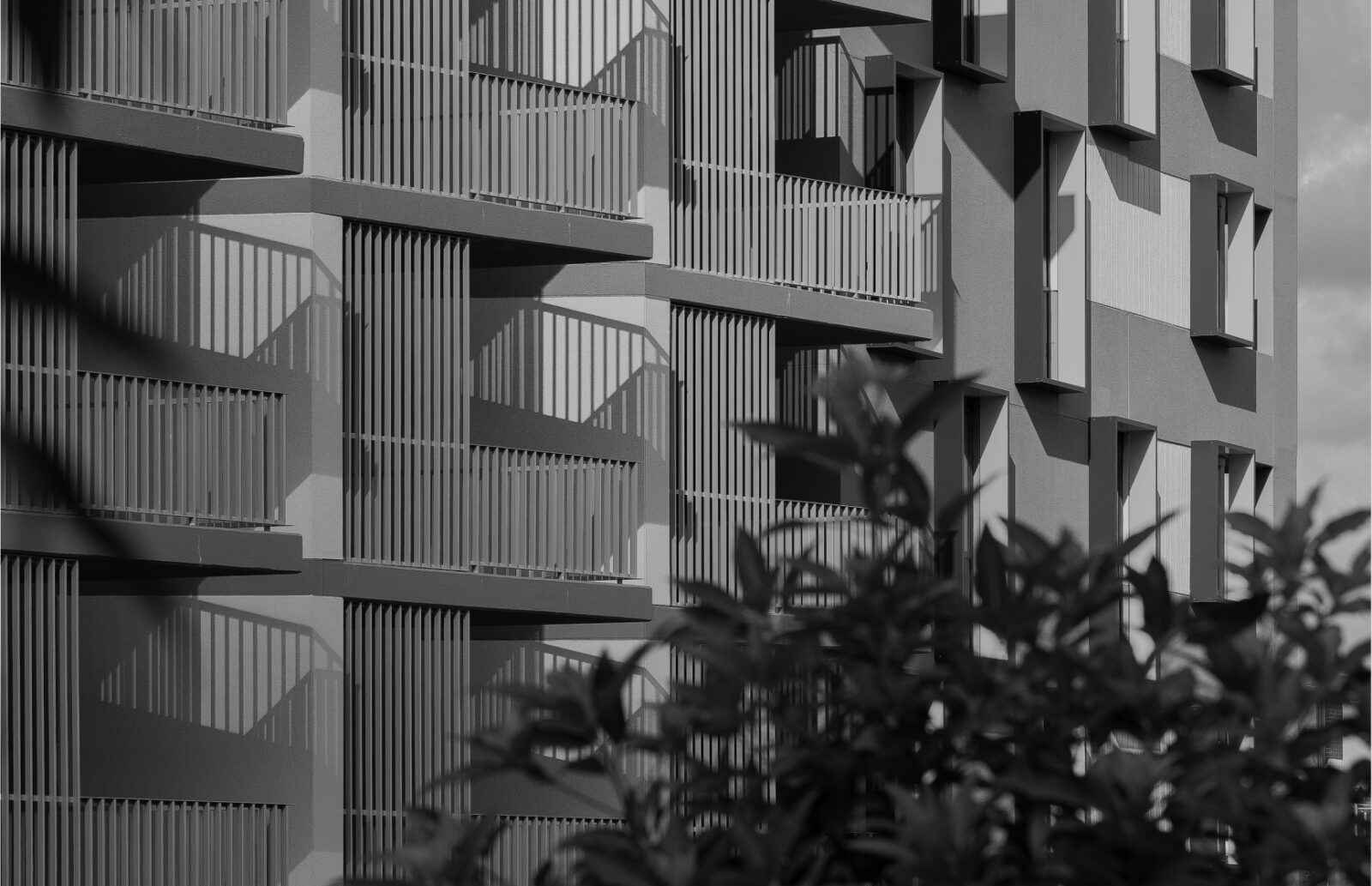
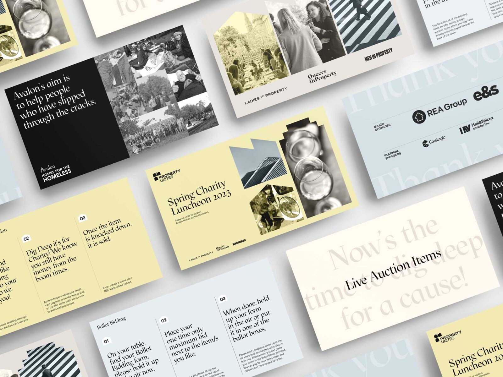
The design was inspired by the organisation being based in Melbourne, taking inspiration from its unique architectural facades and the distinct Hoddle grid. These are represented through a range of shapes that can be used as graphic devices for the brand. The main logo incorporates 3 of these unique shapes to also represent the 3 unique organisations coming together, with an abstract representation of the letter P. The brand identity and graphic elements have been intentionally designed with animation and movement as core considerations.


TEAM
-
Client
Property Unites
-
Branding
Studio White Noise (obviously)
Andreas Pranoto
Ellen McLouhglin
Caitlin Johnston
Dawn Liu
Ross Karabelas
-
Represented Charity
Avalon: Home for the Homeless
-
Events Team
State of Play
-
Print Production
Dr Print
-
Working Groups
Queers in Property
Ladies of Property
Men in Property