Studley Park Residences
Back to our ProjectsClient
Carpe
Sector
Property, Residential
Location
Melbourne, VIC
Year
2024
Brief
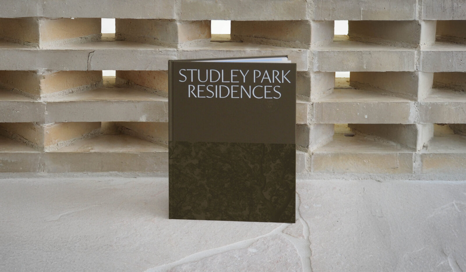
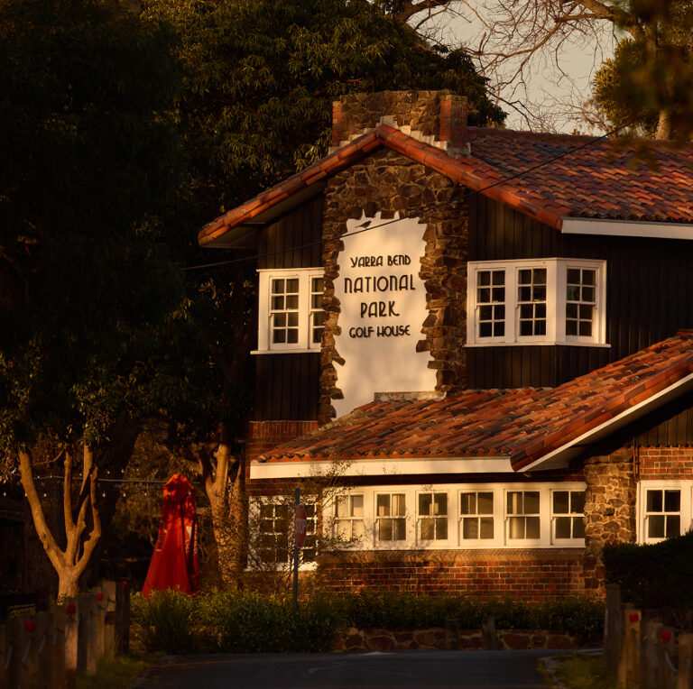
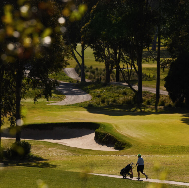
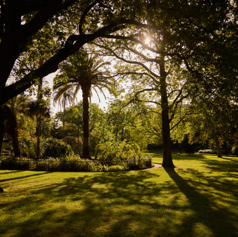
We were engaged to develop the brand for Studley Park Residences, a premium collection of 31 homes in one of Kew’s most elevated and verdant locations. Anchored by a majestic Himalayan Cedar and surrounded by iconic parklands, the identity needed to capture the site’s serene natural beauty, quiet prestige, and grounded lifestyle — setting it apart within Melbourne’s luxury residential market while reflecting Carpe’s ethos of calm, craft, and connection.
Scope of works
- Brand Identity
- Campaign Direction
- Art Direction
- Digital Design
- Creative Strategy
- Publication Design
- Graphic Design
- Animation
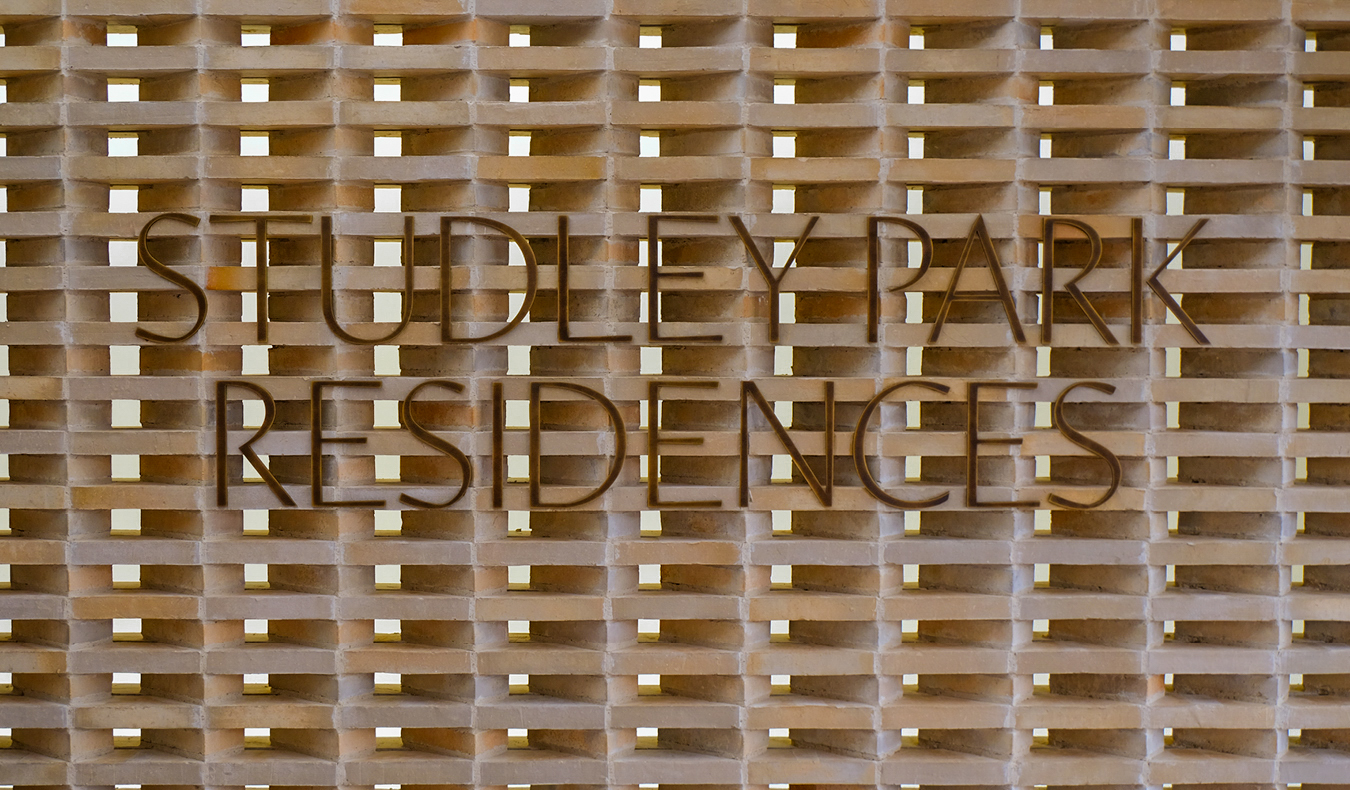
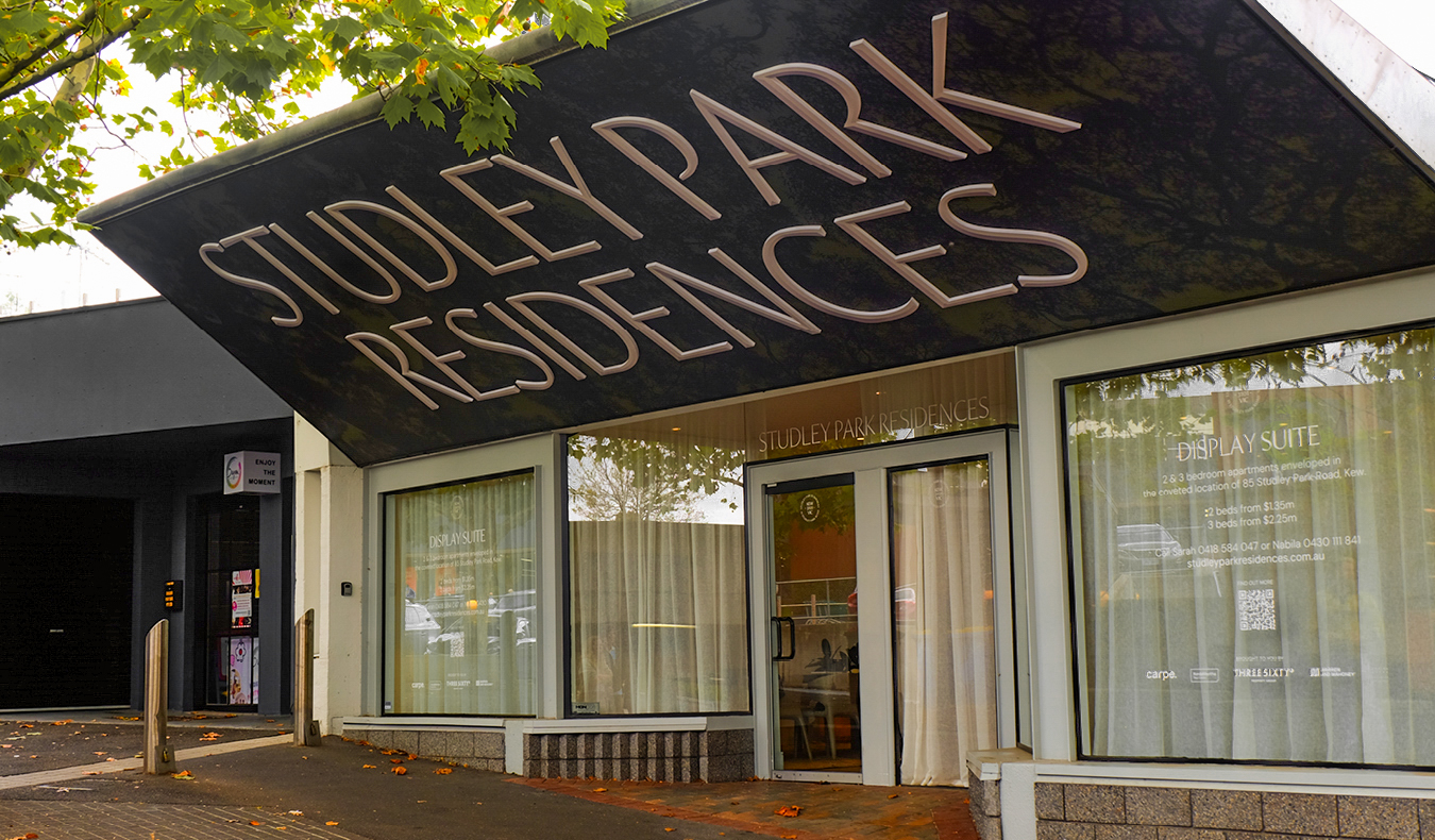
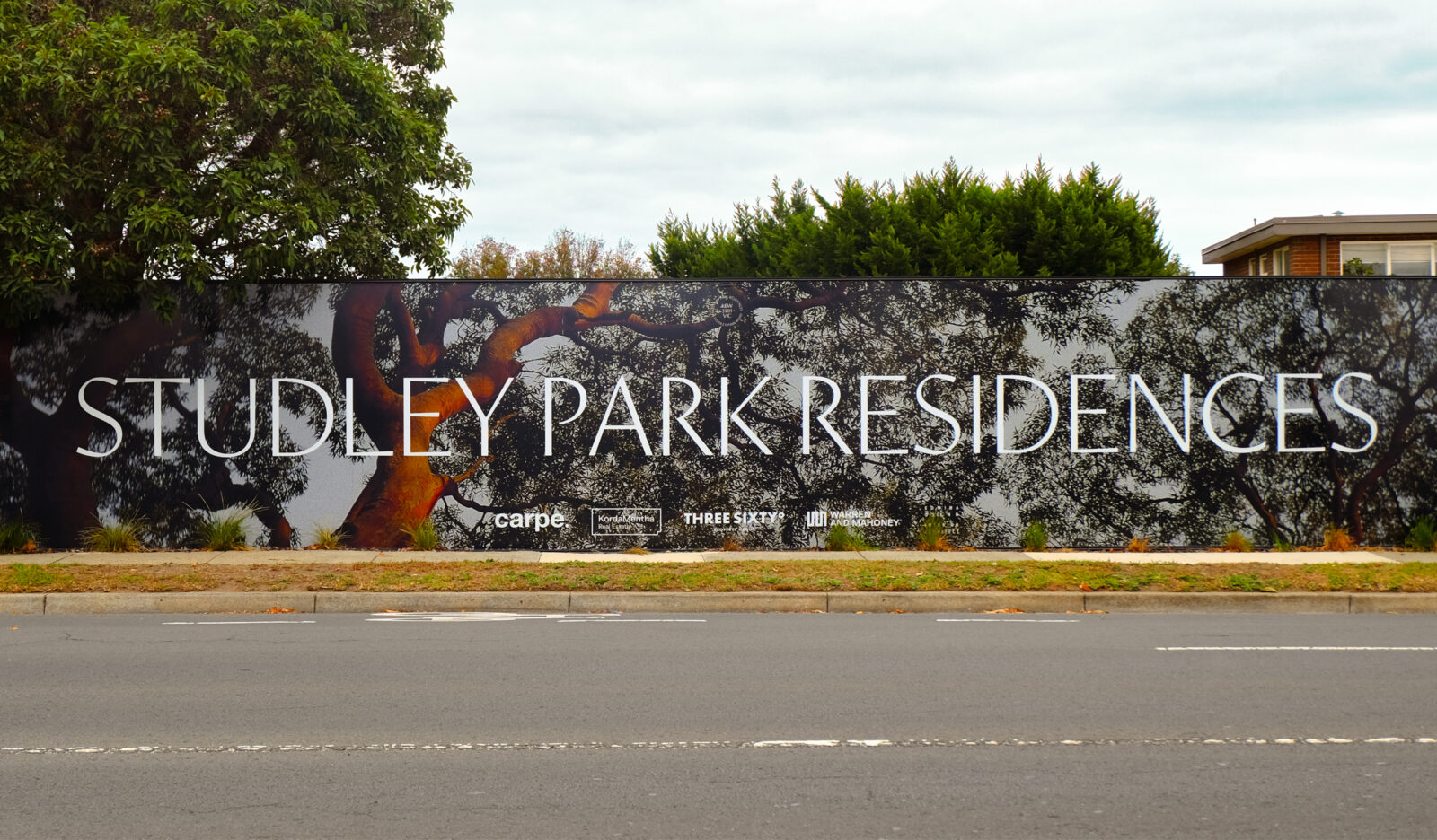
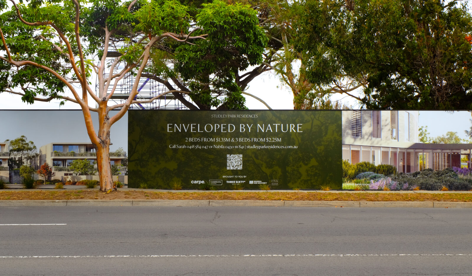
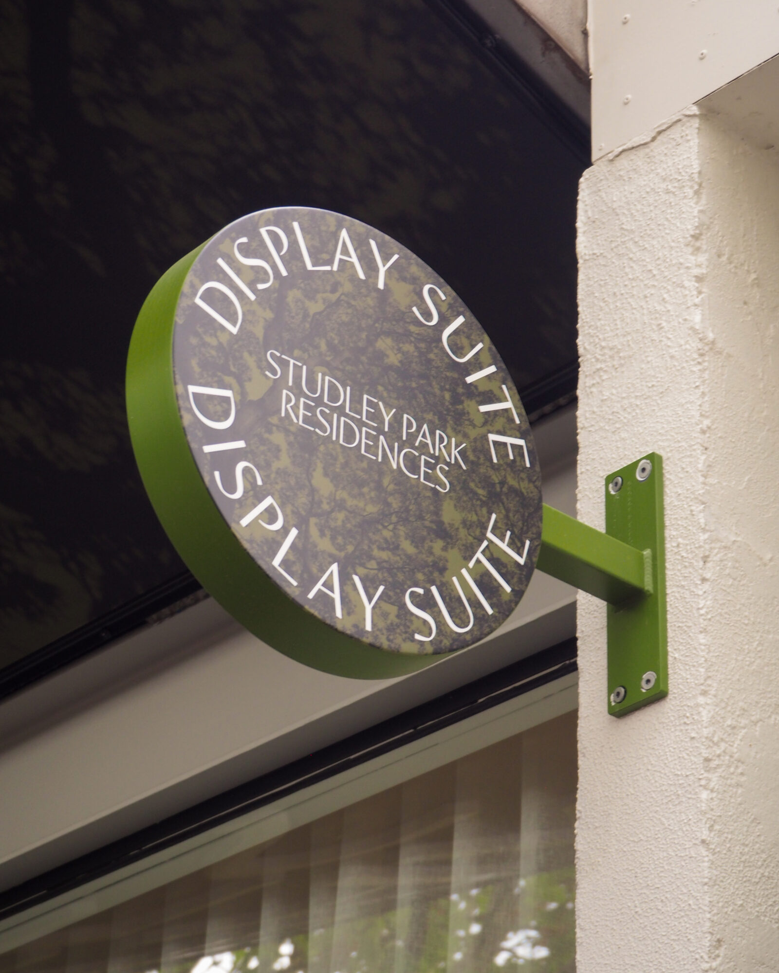
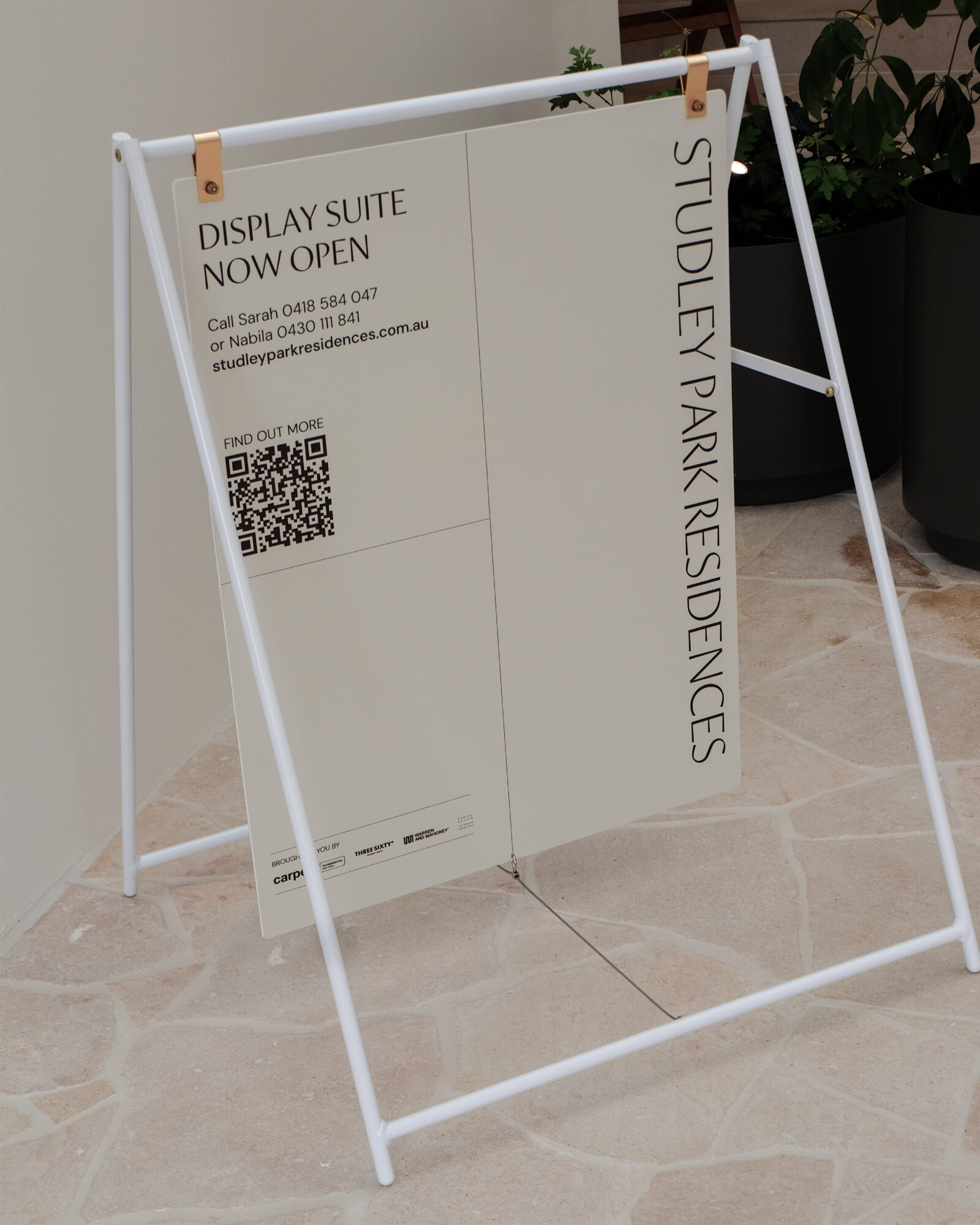
- Environmental/Signage Design
Solution
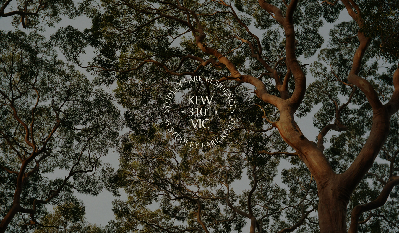
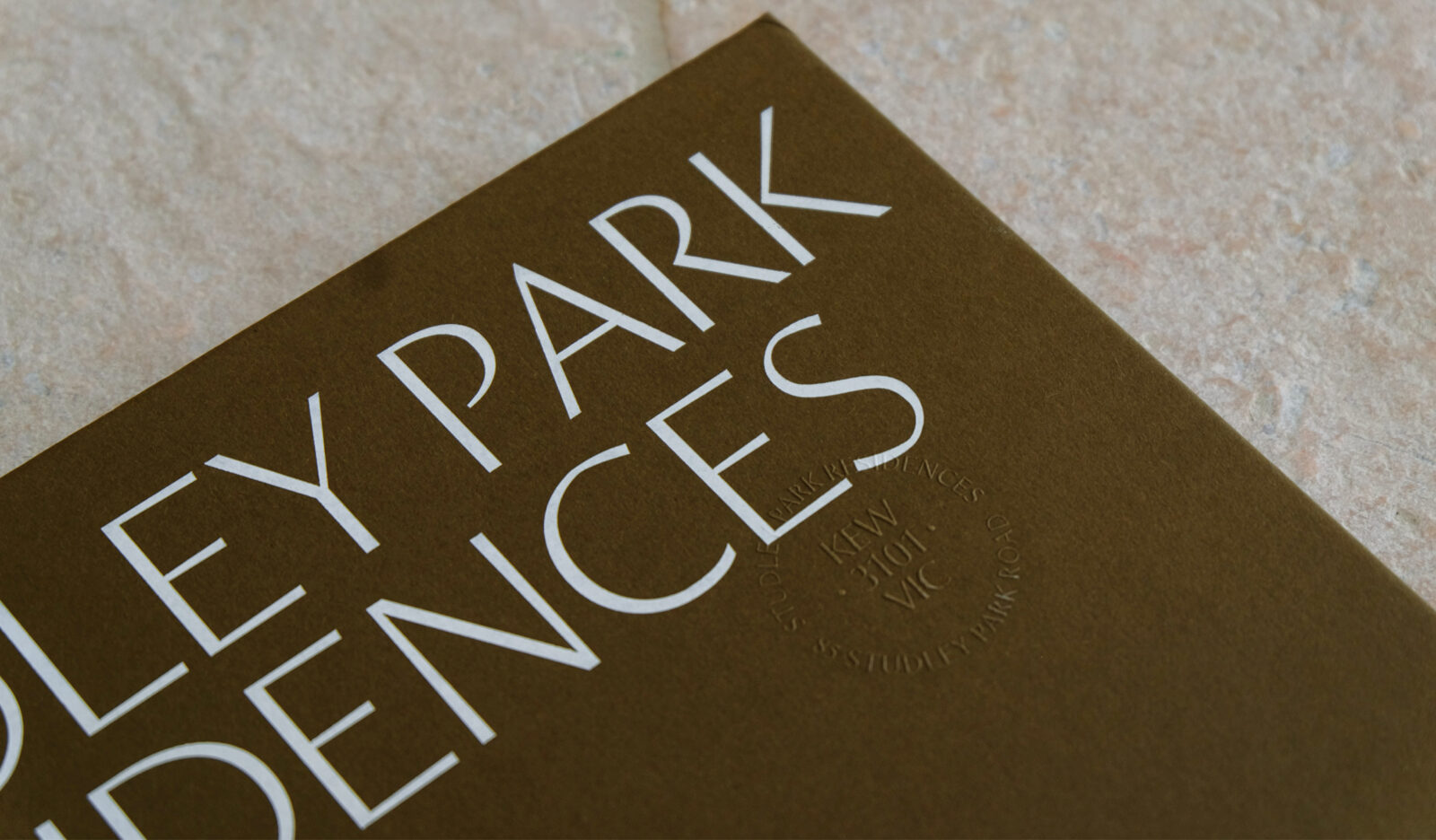
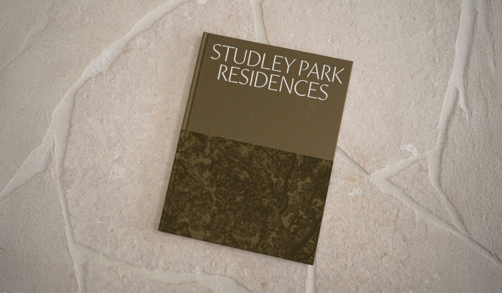
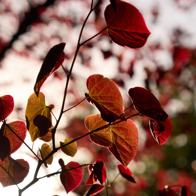
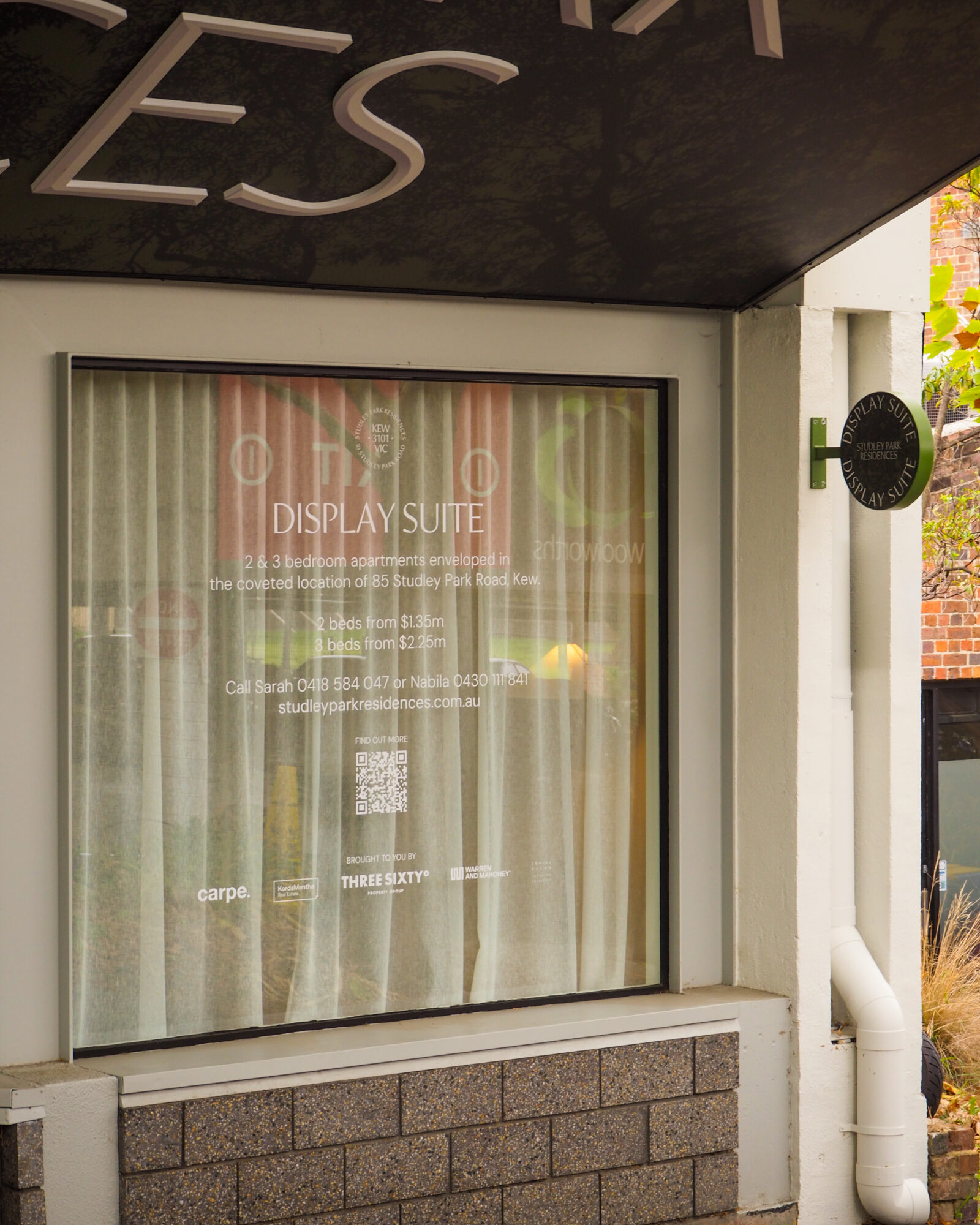
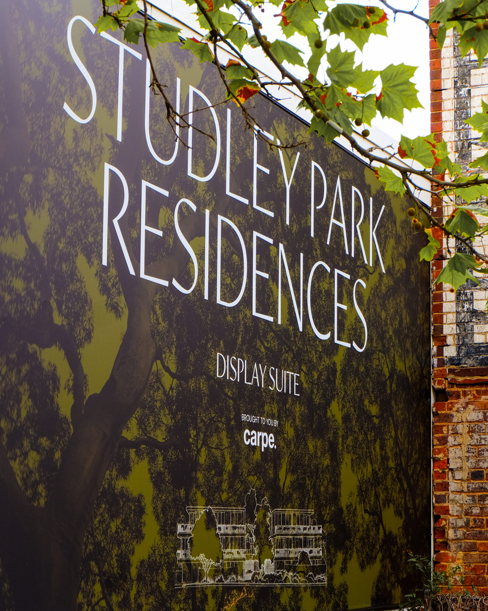
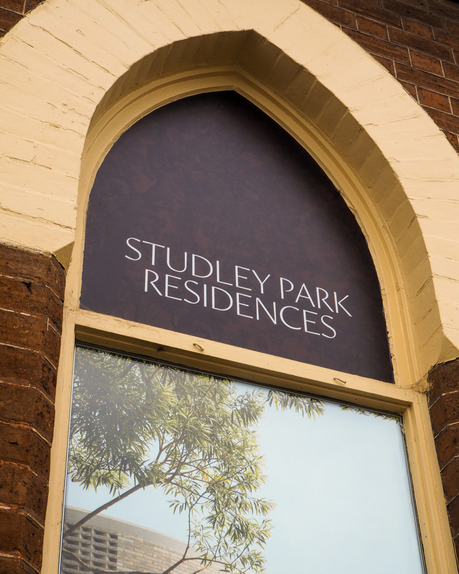
Rooted in the natural beauty of Kew, the identity for Studley Park Residences draws on the project’s serene parkland setting and the central garden that defines it. Inspired by the dappled light and textural calm of the site, we developed a refined brand system anchored in a restrained palette, elegant typography, and an aerial canopy motif that evokes quiet luxury and a strong sense of place. Every touchpoint — from cinemagraph renders and brochure design to spatial signage and photography — was crafted in close collaboration with the wider team to ensure cohesion, clarity, and emotional resonance. The result is a layered, immersive identity that mirrors the project’s architectural integrity and delivers a sophisticated, nature-led living experience.
TEAM
-
Client
Carpe x Korda Mentha
-
Branding
Studio White Noise (obviously)
Lauren Messina
Dawn Liu
Caitlin Johnston
-
Architect
Warren & Mahoney
-
Interior Designers
Edwina Glenn
-
Landscape Architects
John Patrick Landscape Architects
-
Sales Agent
Three Sixty Property Group
-
Copywriter
Weina Ha
-
Web Developer
Equality Media
-
Render Artists
Gabriel Saunders
-
Print Production
Press Print Digital
-
Photographer
James Geer & Saskia Wilson
-
Signage Production
OUTCRY MEDIA