Holdmark Property Group
Back to our ProjectsClient
Holdmark Property Group
Type
Corporate Website
Brief
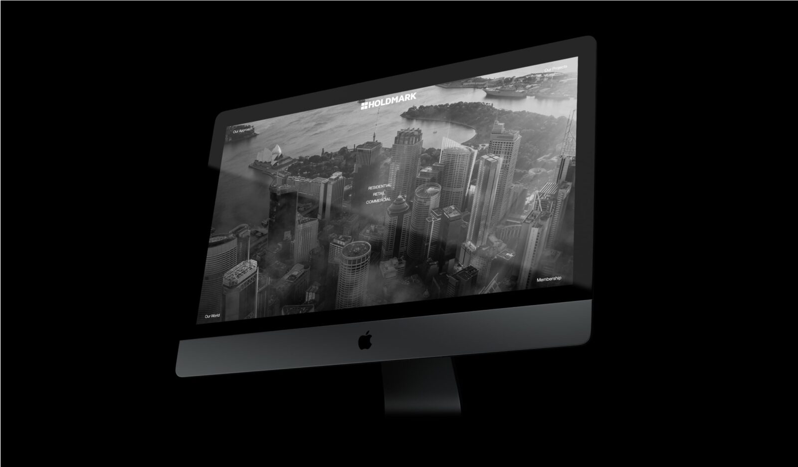
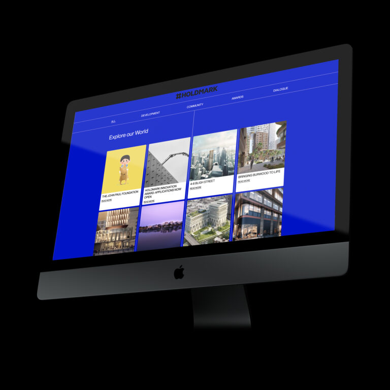
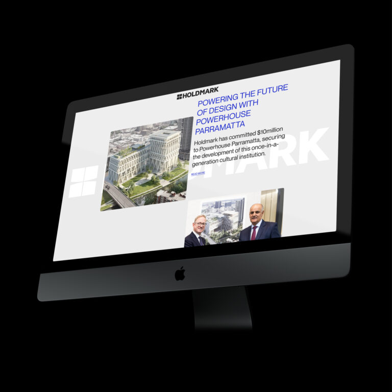
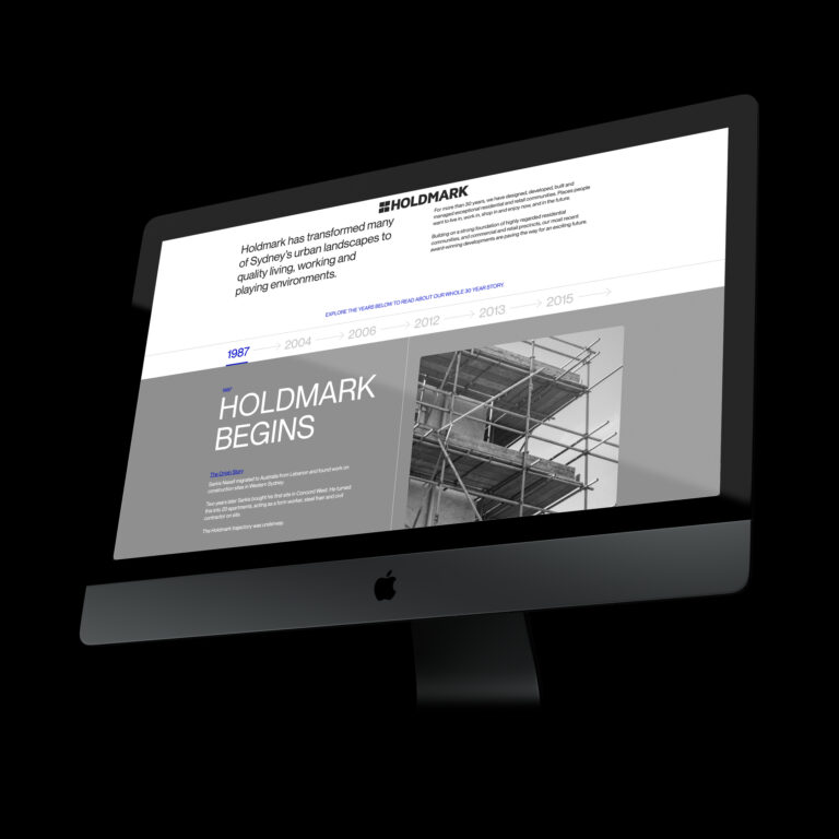
Our task was to design a new website that showcases our client’s three decades of expertise, experience, and projects. We were briefed to infuse the website with energy and modernity to effectively communicate our client’s values and capabilities.
Scope of works
- Art Direction
- Digital Design
- Digital Strategy
- Copywriting
- Graphic Design
Solution
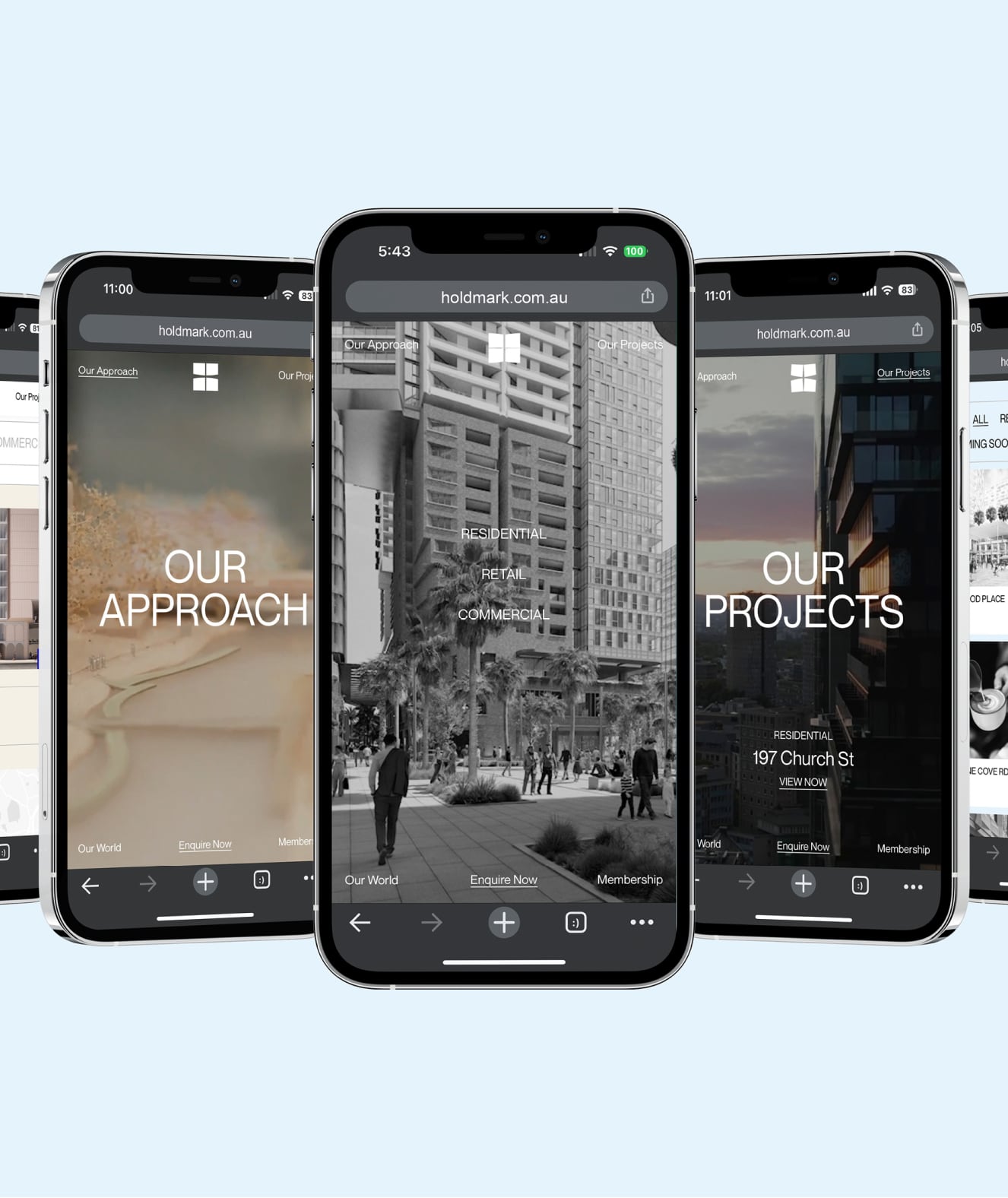
We created an unconventional yet user-friendly website, featuring a menu on each corner of the screen, inspired by the Holdmark logo. Video and footage were utilised as headers for each main page, resulting in a more engaging user experience. The website’s accent colour, cobalt blue, adds energy to the design, and interactive elements such as an animating logo, interactive colour changes, and movement in website modules were incorporated to enhance user interactivity.
TEAM
-
Client
Holdmark Property Group
-
Branding
Studio White Noise (obviously)
Lauren Messina
Ross Karabelas
-
Copywriter
Writers
-
Web Developer
Efront Digital
