Branson Group | Studio White Noise
You can see Lune from my house

Branson Group

Back to our Projects
Brief

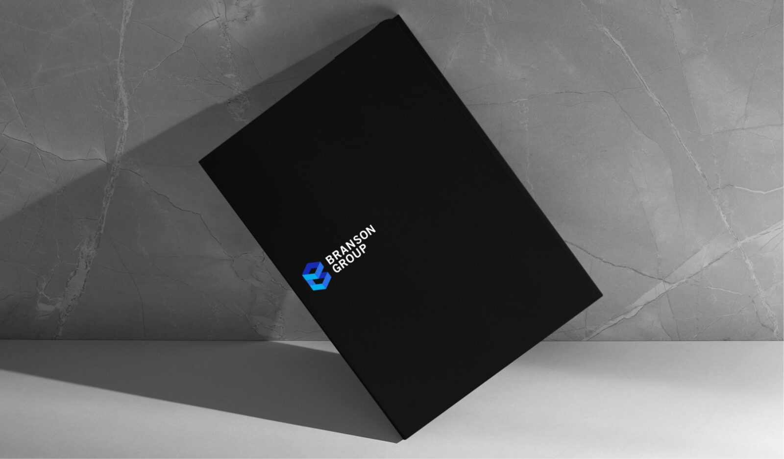
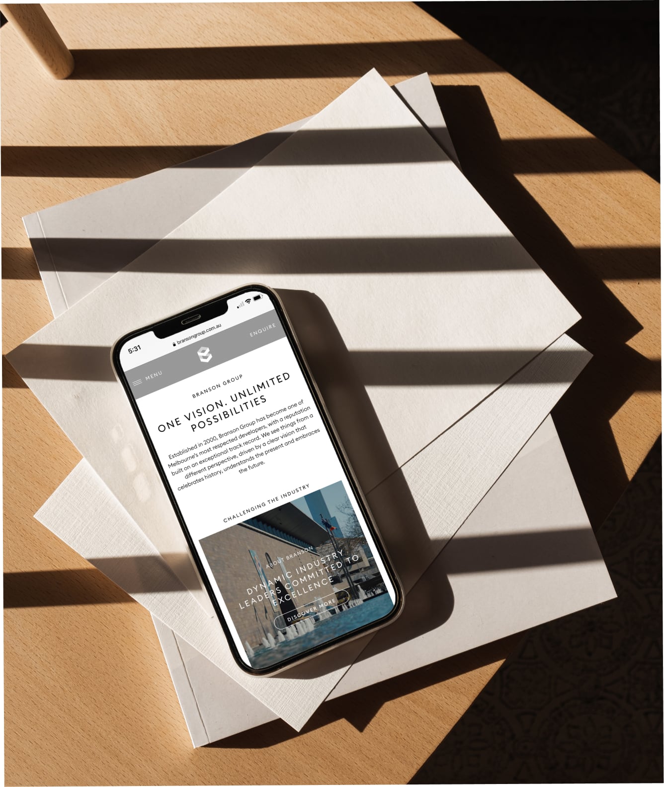
The task for this project was to refresh Branson Group’s brand and to streamline all their current and future projects into a house look and feel.


bransongroup.com.au

Scope of works
  • Brand Identity
  • Campaign Direction
  • Art Direction
  • Digital Design
  • Creative Strategy
  • Graphic Design
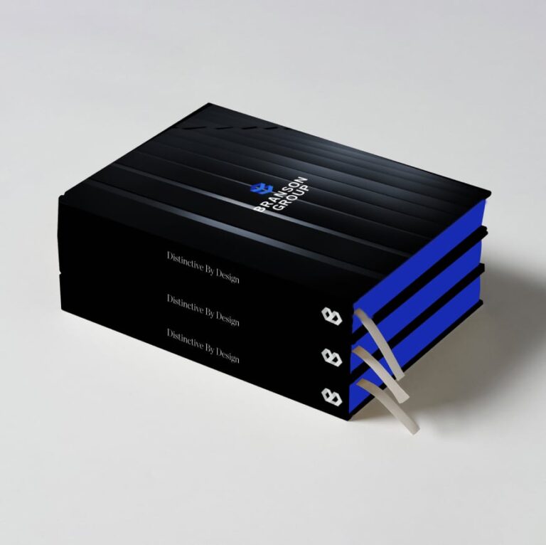
A stack of three black hardback books with blue page edges and ribbon bookmarks, titled Dialectics By Design. The top book features a blue logo and the words Paragon Group, reflecting consistent branding for versatility on a light surface.
A man wears a black quilted gilet with the Branson Group logo and name on the left chest, ensuring consistent branding for versatility. The gilet zips over a grey long-sleeve shirt, and the man's face is partially visible.
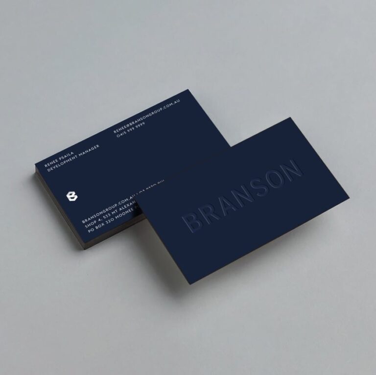
Two navy-blue business cards on a light grey surface reflect Branson Group’s consistent branding for versatility. One card features BRANSON embossed; the other shows contact information in white text, including name, title, email, and company logo.
Solution

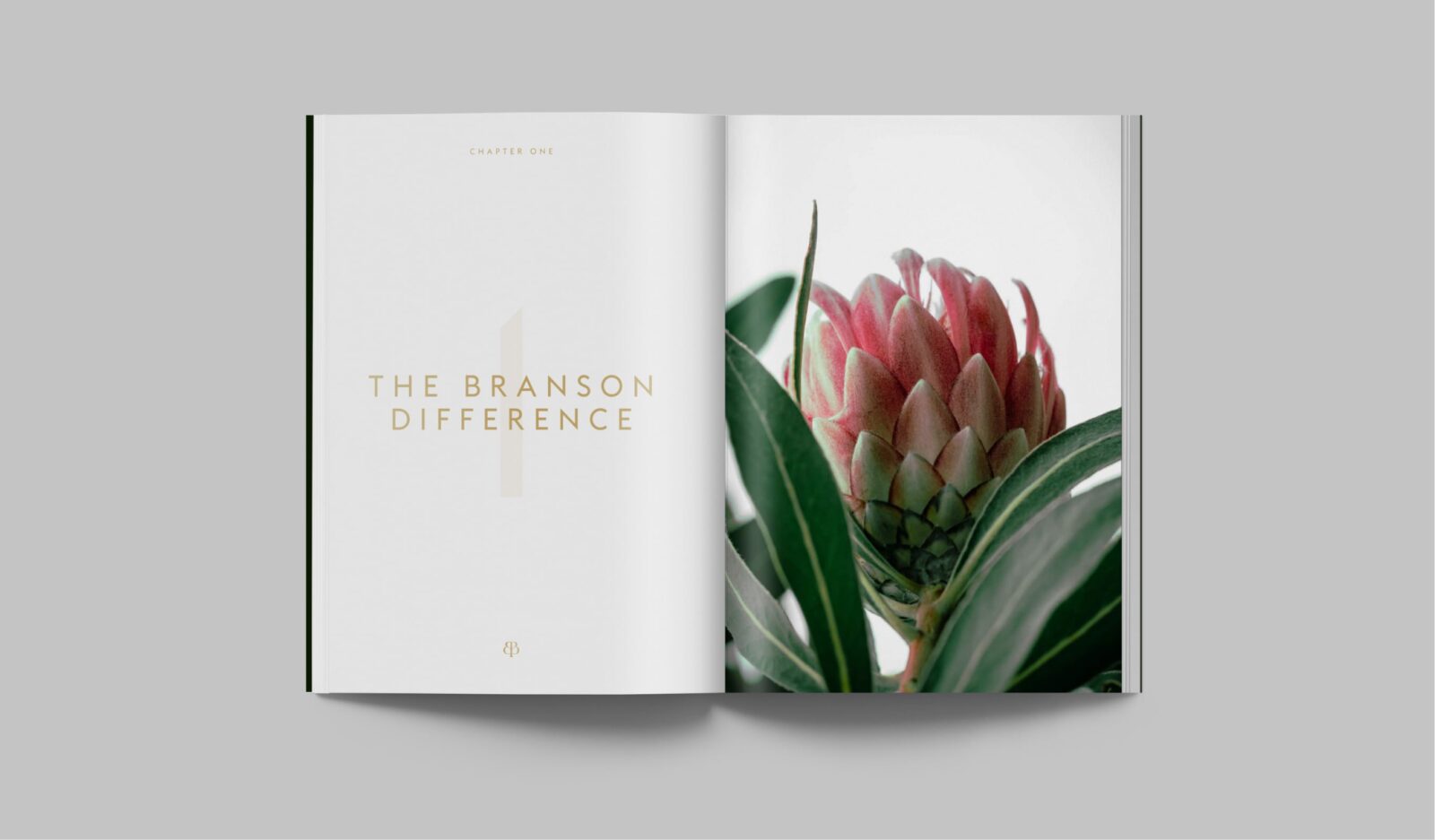
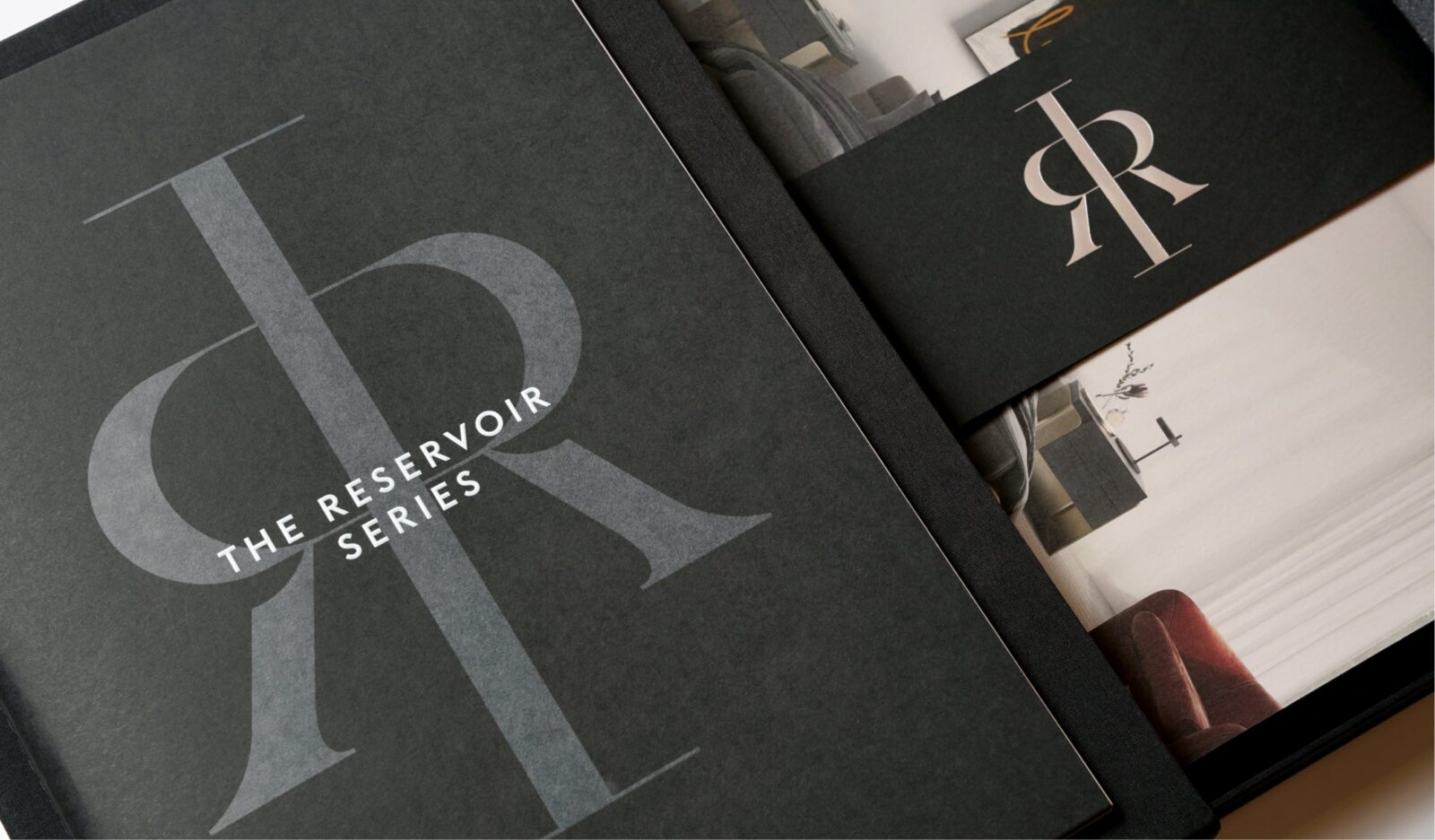
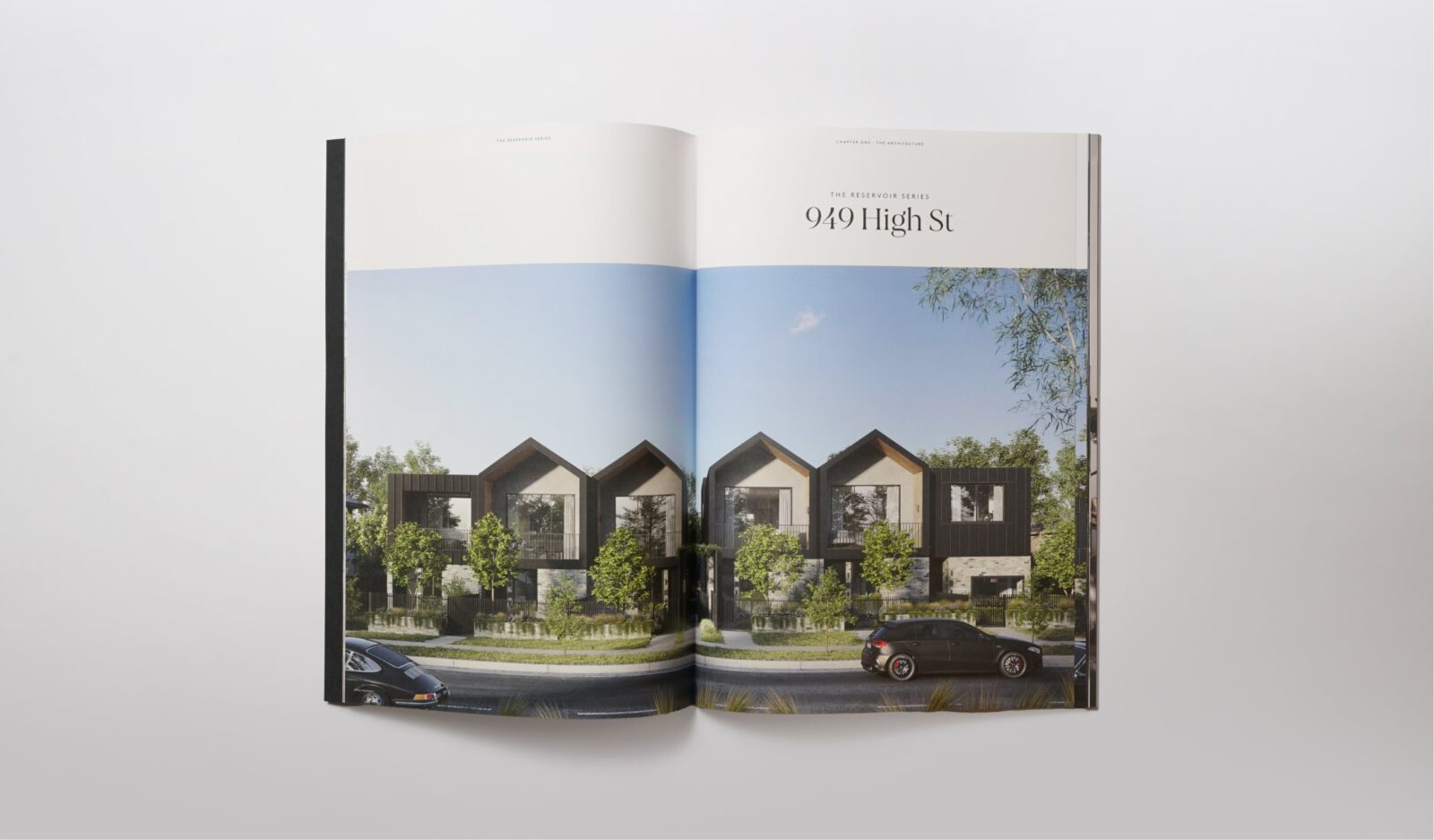
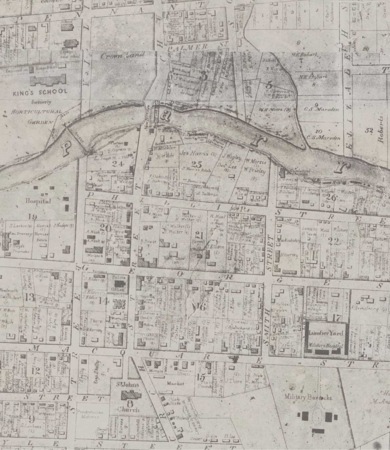
We transformed the Branson Group’s corporate identity and branding to ensure all brand assets are consistent. We extended the identity system to make sure it’s flexible enough to be used in all applications. For townhome projects, we created a design system where the same main typography is used to act as a thread that ties all projects together. Each individual project then has their own monogram and display font to express each unique brand.
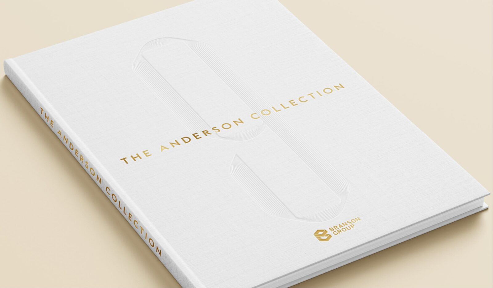
Beige background with thin, gold, symmetrical lines forming an abstract shape resembling a tall, stylised letter A or U. Centred are the words The Anderson Collection in black text—consistent branding for versatility by Branson Group.
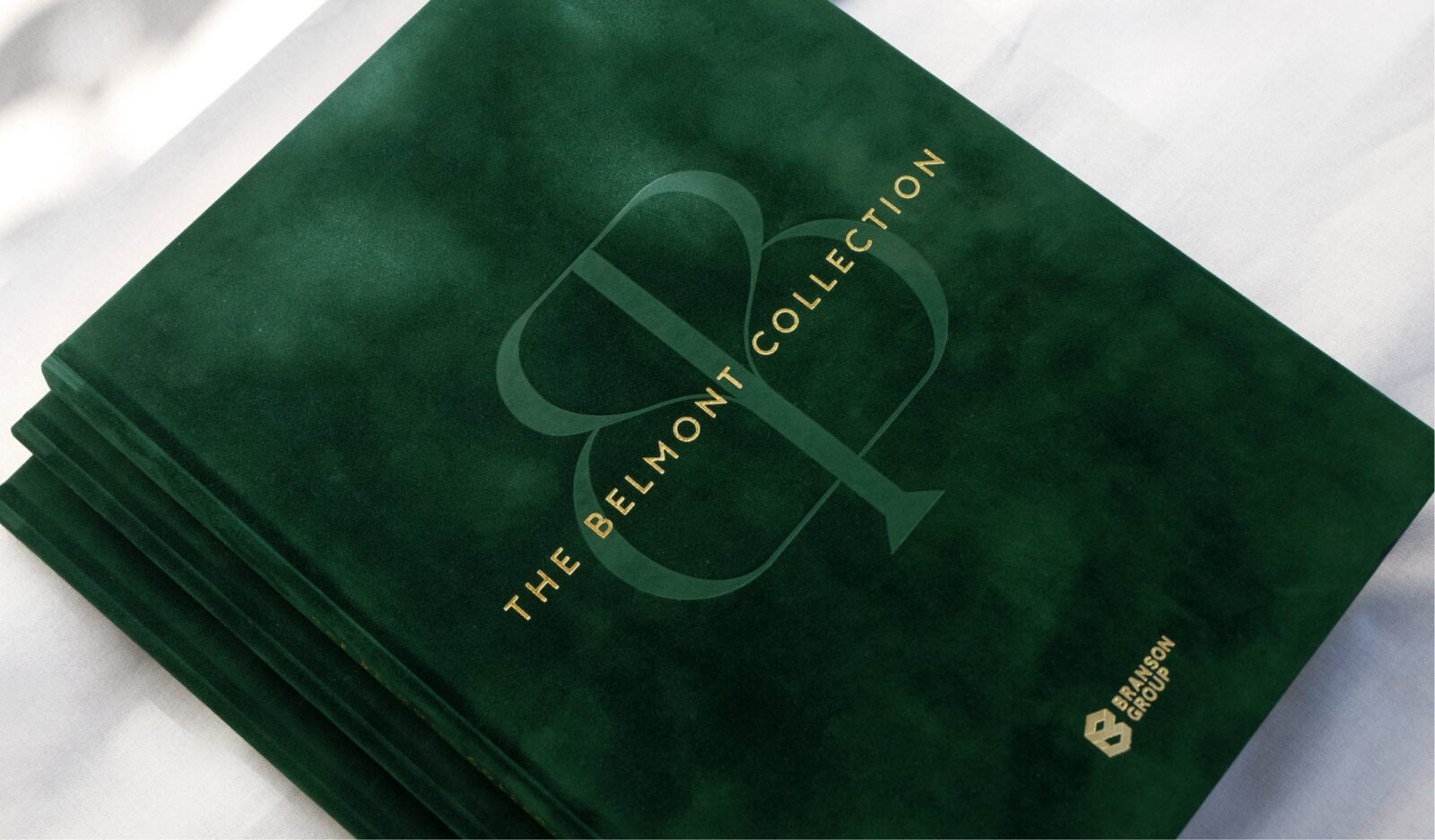
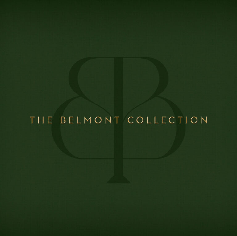
Dark green background with a large, faint, stylised B and P monogram. Centred gold text reads THE BELMONT COLLECTION. The Branson Group ensures consistent branding for versatility in this simple, elegant design.
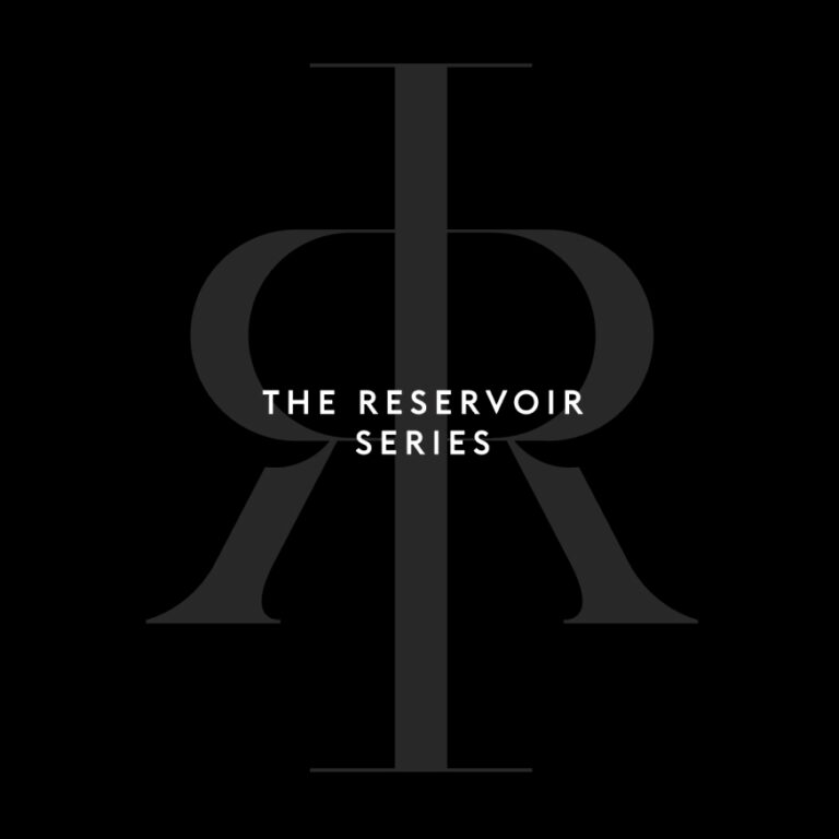
Black background with large, overlapping dark grey R letters facing opposite directions and a central vertical bar. White text in the middle reads THE RESERVOIR SERIES, reflecting Branson Group: Consistent branding for versatility.

TEAM

  • Client

    Branson Group

  • Branding

    Studio White Noise (obviously)

    Andreas Pranoto

    Ross Karabelas

  • Web Developer

    Efront Digital