Queers in Property | Studio White Noise
You can see Lune from my house

Queers in Property

Back to our Projects
Brief

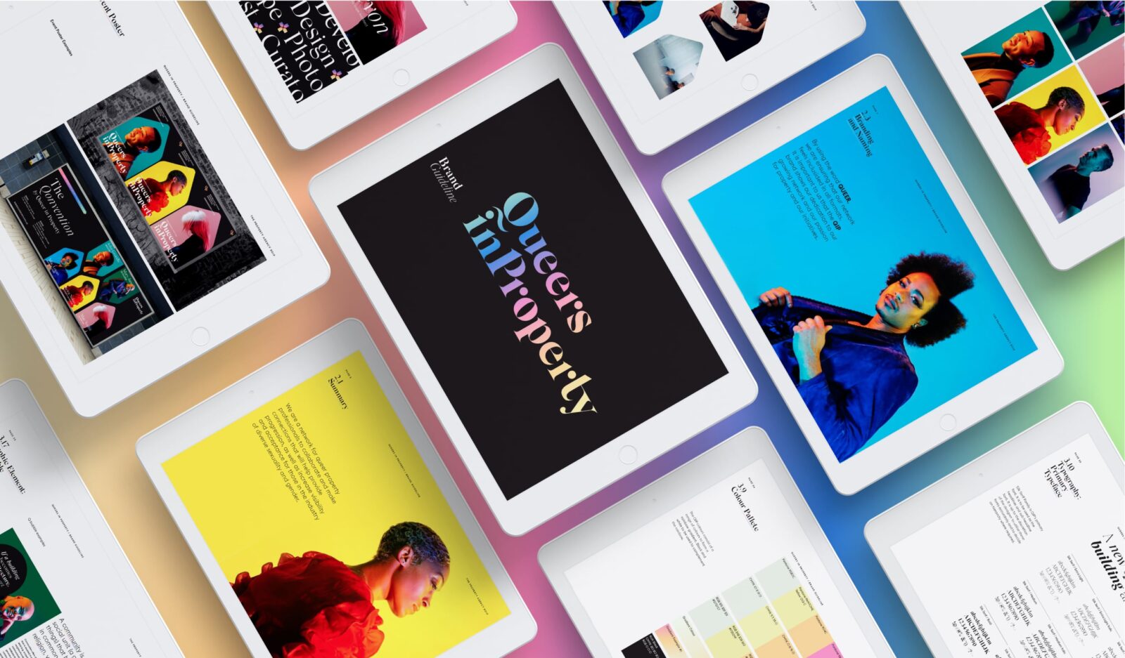
Queers in Property, a not-for-profit professional networking group based in Melbourne was seeking to create an inclusive brand that resonated with the queer community within the property and construction sectors. The brand need to reflecting their three key brand pillars, visibility, empowerment and support and needed to be adaptable to changing needs and priorities as their network grew.


queersinproperty.com.au

Scope of works
  • Brand Identity
  • Campaign Direction
  • Art Direction
  • Digital Design
  • Creative Strategy
  • Copywriting
  • Graphic Design
  • Illustration
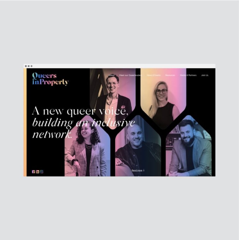
Website homepage for Queers in Property featuring five people’s portraits and the text A new queer voice, building an inclusive network. Proudly empowering Queers in Property, championing visibility, support, and empowerment through colourful gradients and a modern layout.
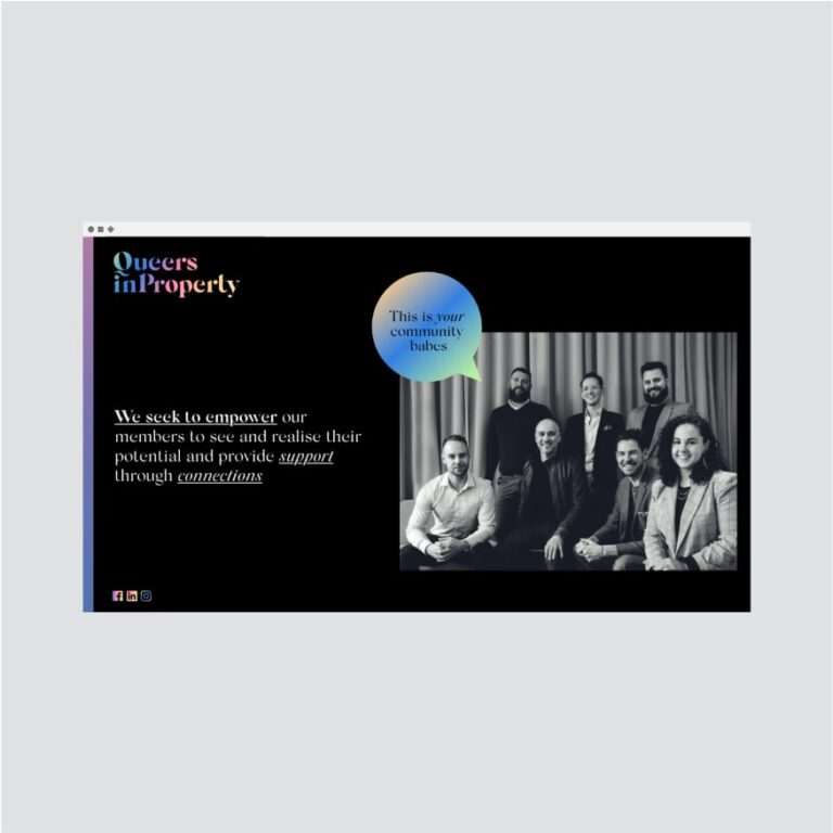
Screenshot of a website for Queers in Property showing a group photo of eight people, with text about proudly empowering members and championing visibility, plus a blue circle stating, This is your community babes.
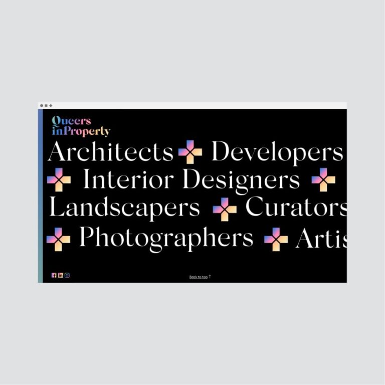
A website section with a black background proudly empowering Queers in Property—Architects, Developers, Interior Designers, and more—championing visibility, support, and empowerment through colourful geometric icons beside each profession.
Solution

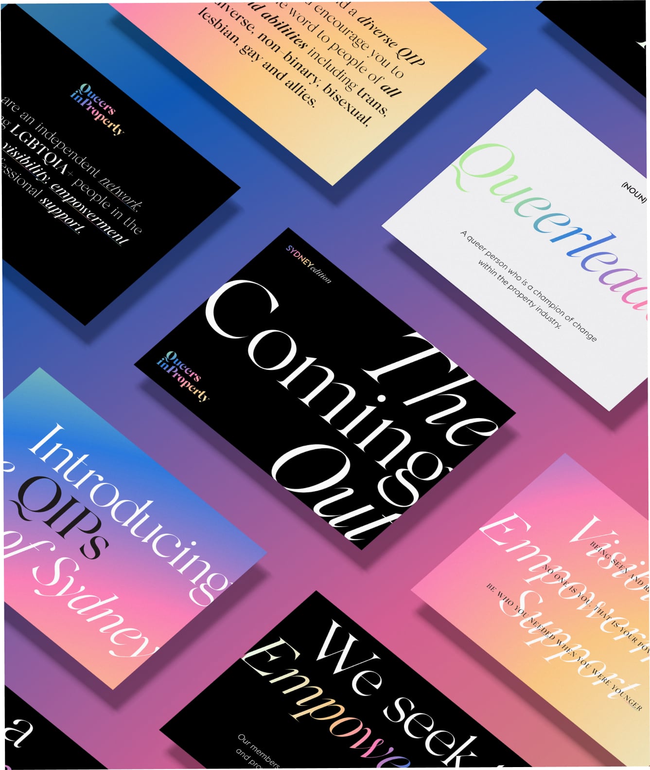
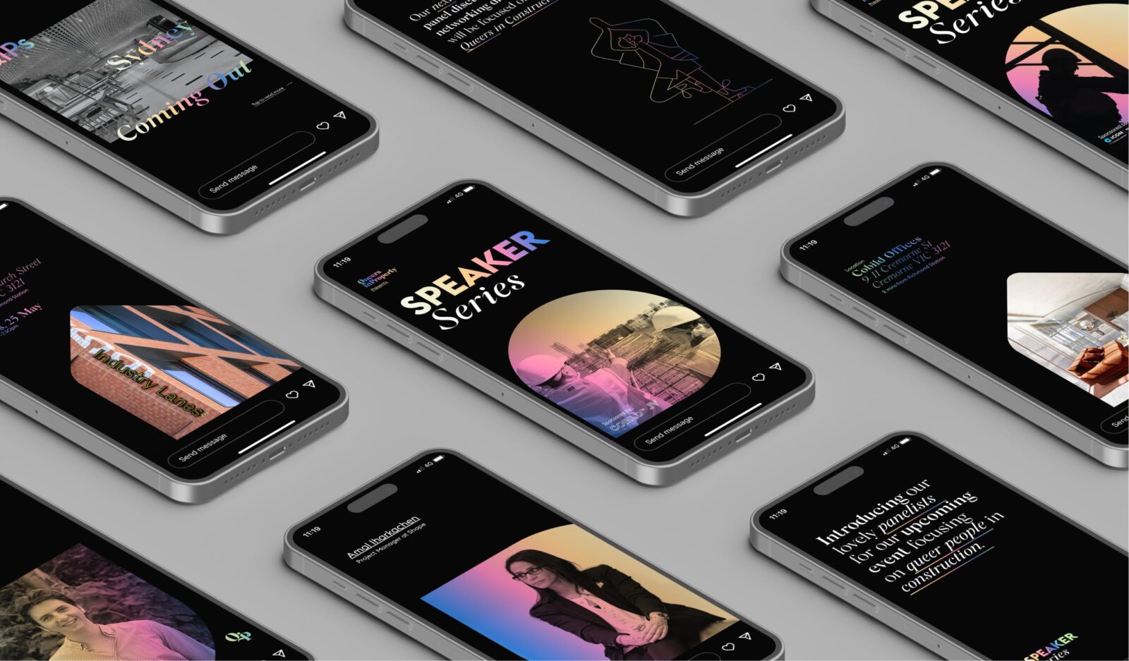
We began by crafting a classic brand mark with a vibrant and modern representation of pride colors, seamlessly blending them into a gradient to signify unity within the queer community. To elevate the brand’s professionalism, we’ve chosen bold, editorial serif fonts that exude a sense of sophistication, making them ideal for a network of peers. Our creative approach emphasises inclusivity, featuring dynamic images that showcase a diverse spectrum of individuals. This visual diversity reinforces the message of unity and acceptance, celebrating uniqueness within the community.

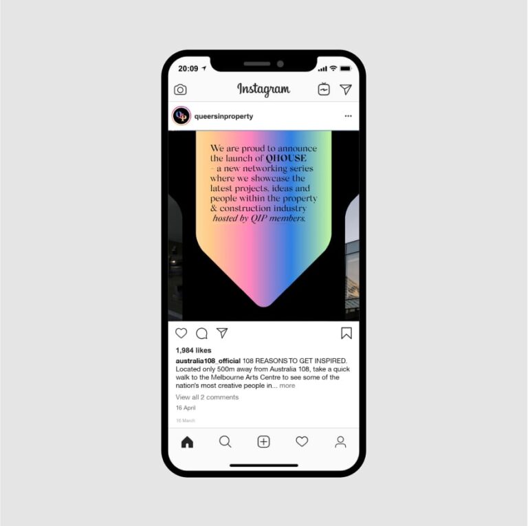
A smartphone displays an Instagram post from @queersinproperty, featuring a gradient background with text announcing the launch of QIPOSE—proudly empowering Queers in Property and championing visibility, support, and empowerment in the industry.
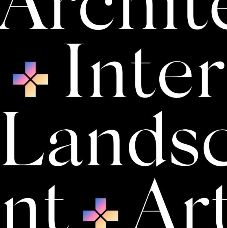
Large white serif text on black spells out partial words: Archite, Inter, Landsc, and Art. Gradient geometric plus symbols in pastels appear between the words—proudly empowering Queers in Property and championing visibility, support, and empowerment.
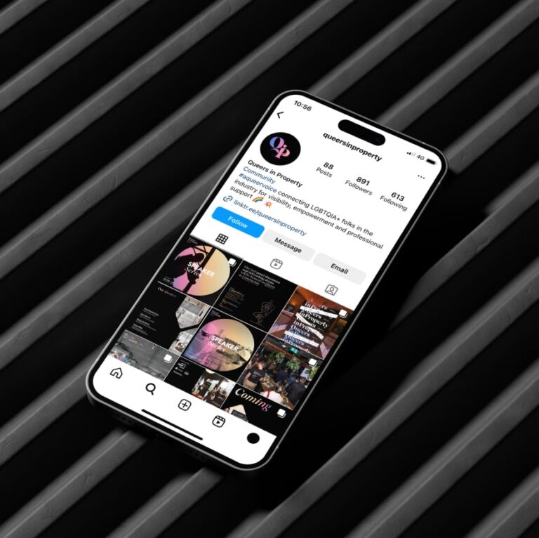
A smartphone displaying the Queers in Property Instagram profile rests on a diagonal, dark-striped surface, proudly empowering and championing visibility, support, and empowerment within the community through vibrant posts and engaging content.

TEAM

  • Client

    Queers in Property

  • Branding

    Studio White Noise (obviously)

    Andreas Pranoto

    Lauren Messina

    Rossco Karabelas

  • Web Developer

    EFront Digital

  • Strategy

    Meg Patten
    Ben Rowe
    Rossco Karabekas