Malvern Collective Retail
Back to our ProjectsClient
Kokoda Property
Sector
Property, Retail
Location
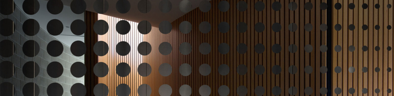
Malvern, VIC
Year
2022
Brief
We were asked to create a bold and engaging brand identity that represents the exciting retail opportunities at the already established Malvern Collective by Kokoda Property.
Scope of works
- Brand Identity
- Campaign Direction
- Art Direction
- Digital Design
- Creative Strategy
- Graphic Design

Solution
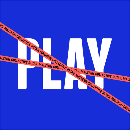
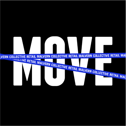
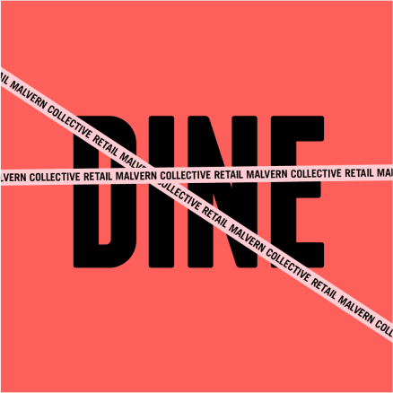
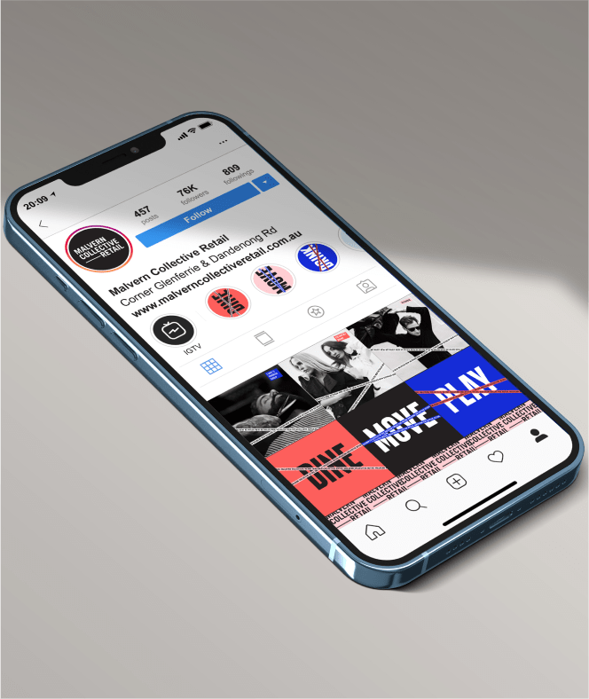
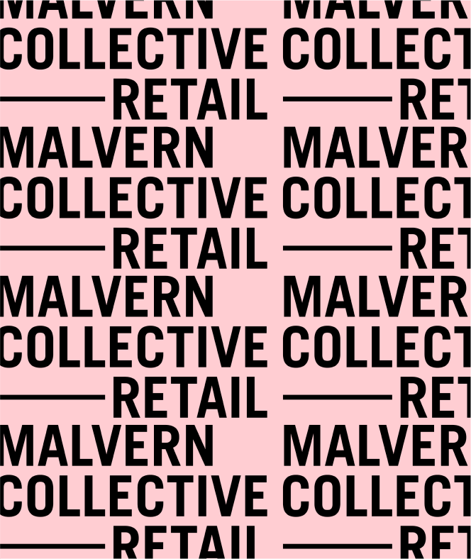
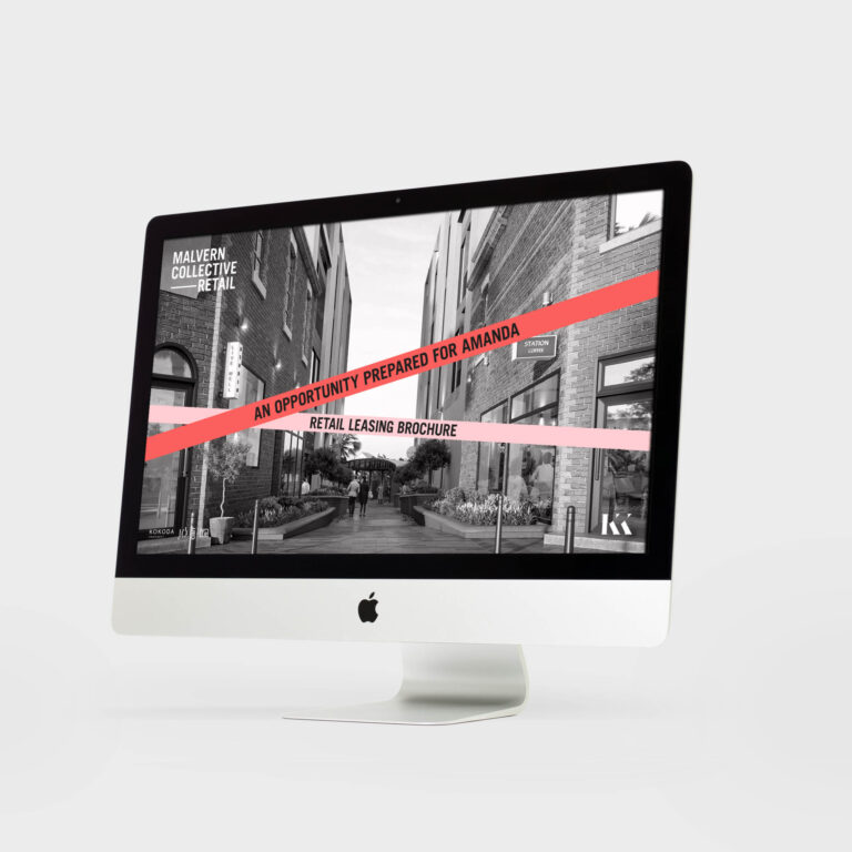
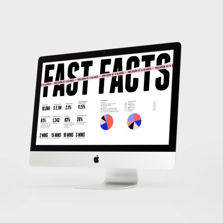
Using the Malvern Collective’s existing logo and brand presence, we added ‘—Retail’ to the logo and reinterpreted the creative with a more vibrant expression. This allows the design to be adaptable to any Kokoda Property that offers retail spaces. Using a bold colour palette and short, sharp messaging, we clearly communicated the exciting offerings coming soon, with playful graphic applications of a tape device, pasted over all collateral to draw attention.

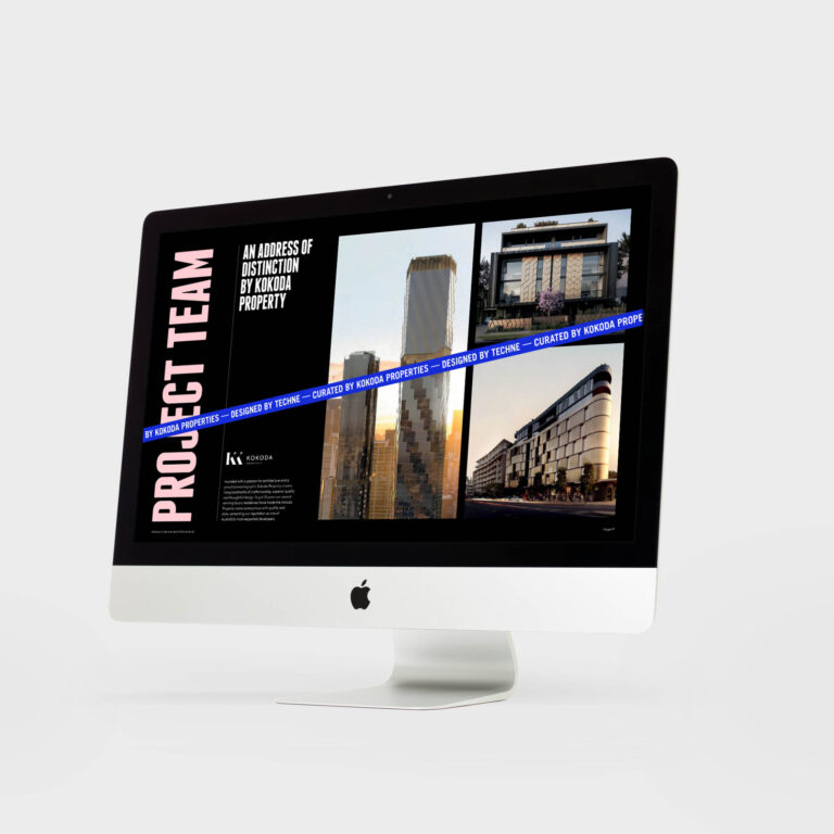
TEAM
-
Client
Kokoda Property
-
Branding
Studio White Noise (obviously)
Andreas Pranoto
Lauren Messina
Ross Karabelas
-
Architect & Interior Designers
Carr
-
Render Artists
Flood Studio
-
Signage Production
Outcry Media