Cera Stribley
Back to our ProjectsClient
Cera Stribley
Sector
Arts & Design, Corporate
Location
Melbourne, VIC
Year
2023
Brief
We were tasked to deliver a strategic brand refresh with a strong rationale for the already established design studio Cera Stribley, one that will allow the brand to evolve and be adaptable as the business continues to grow.
Scope of works
- Brand Identity
- Campaign Direction
- Art Direction
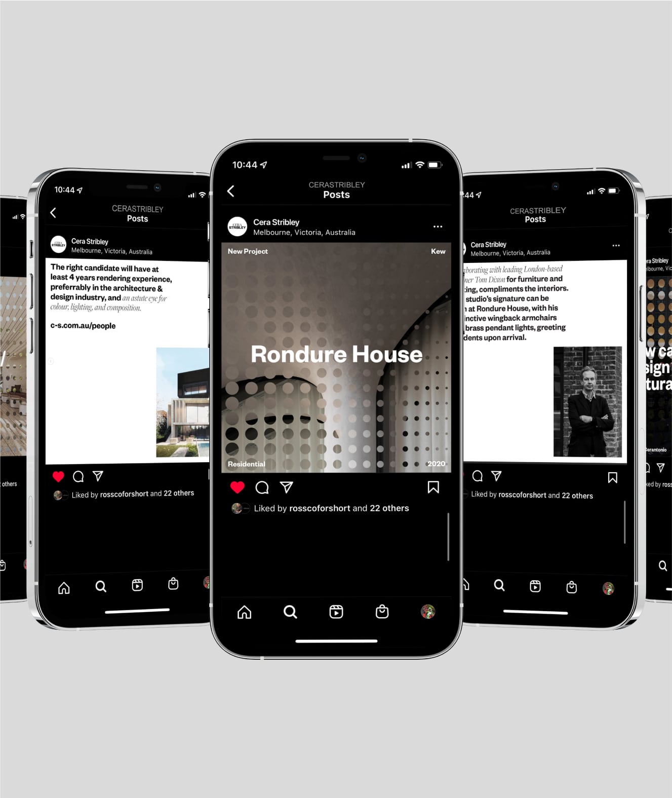
- Digital Design
- Creative Strategy
- Copywriting
- Graphic Design
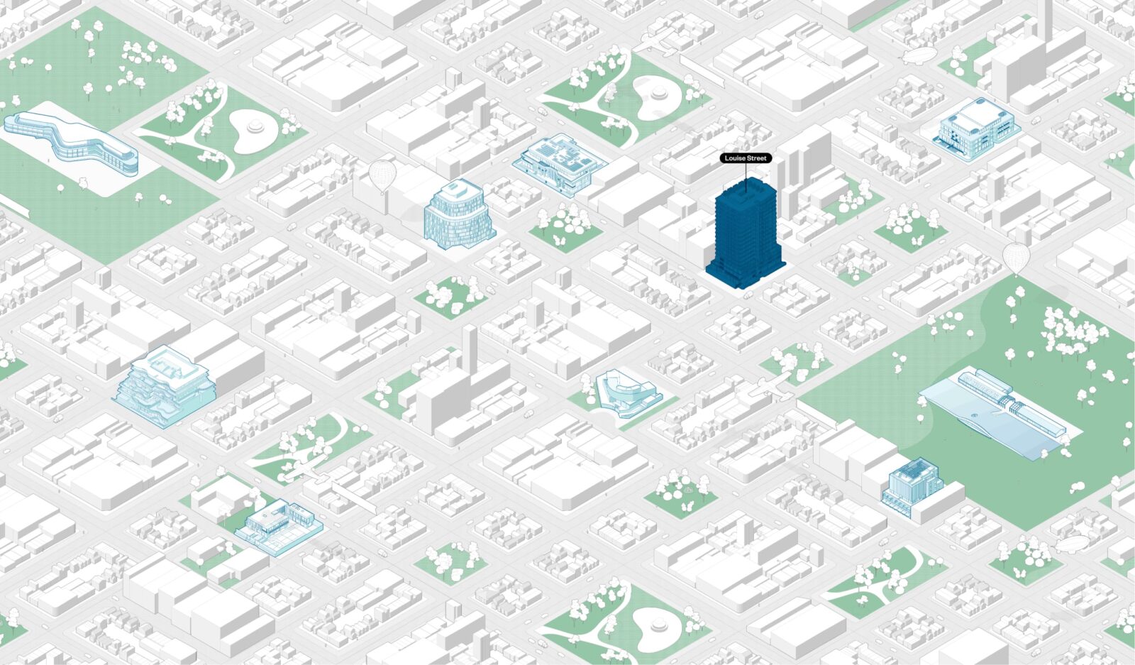
- Illustration


Solution
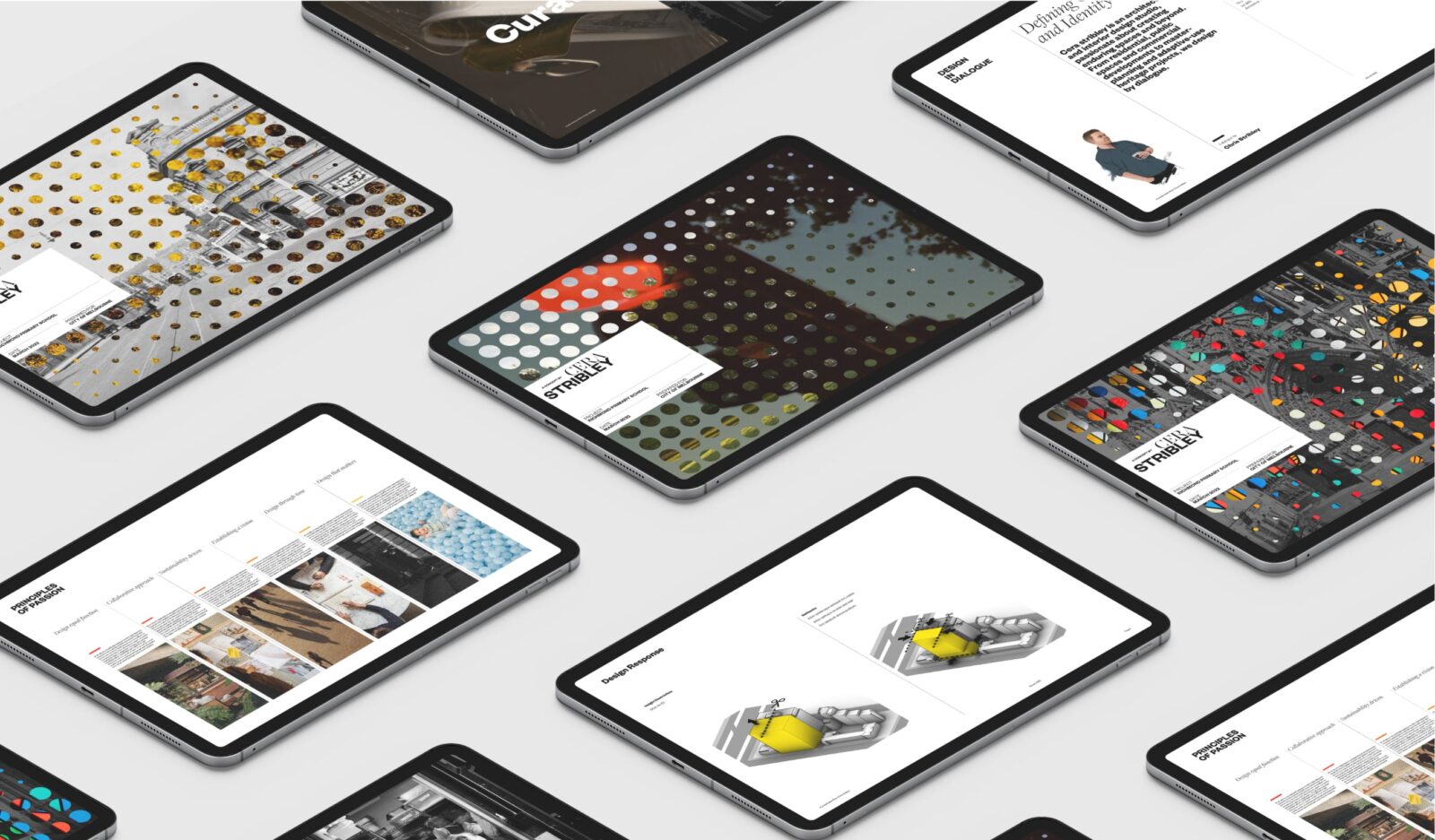
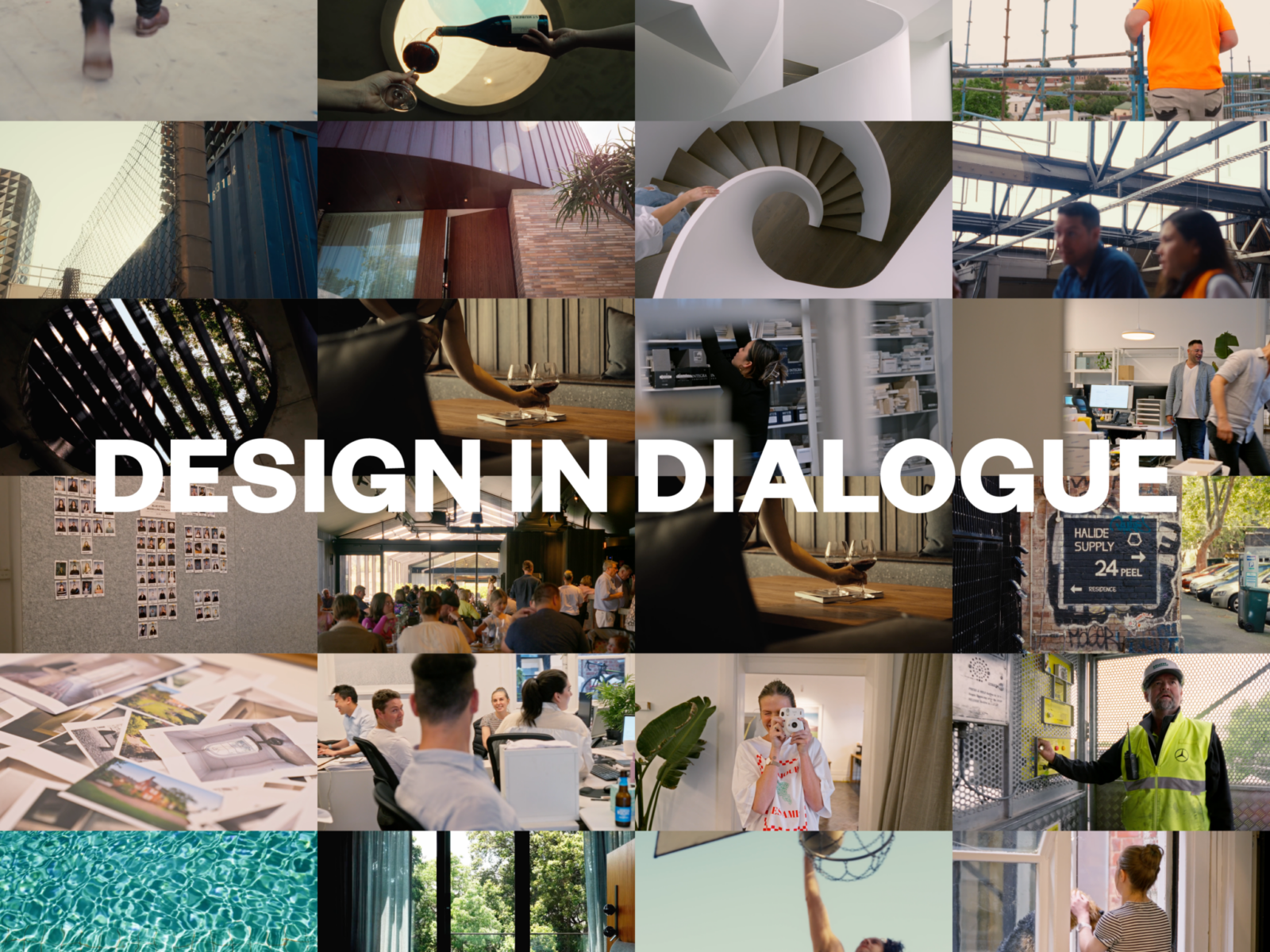
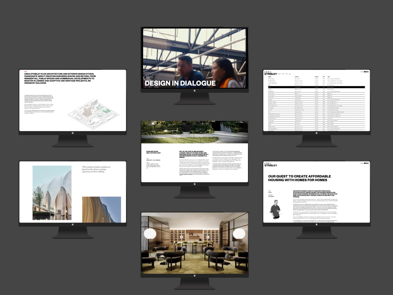
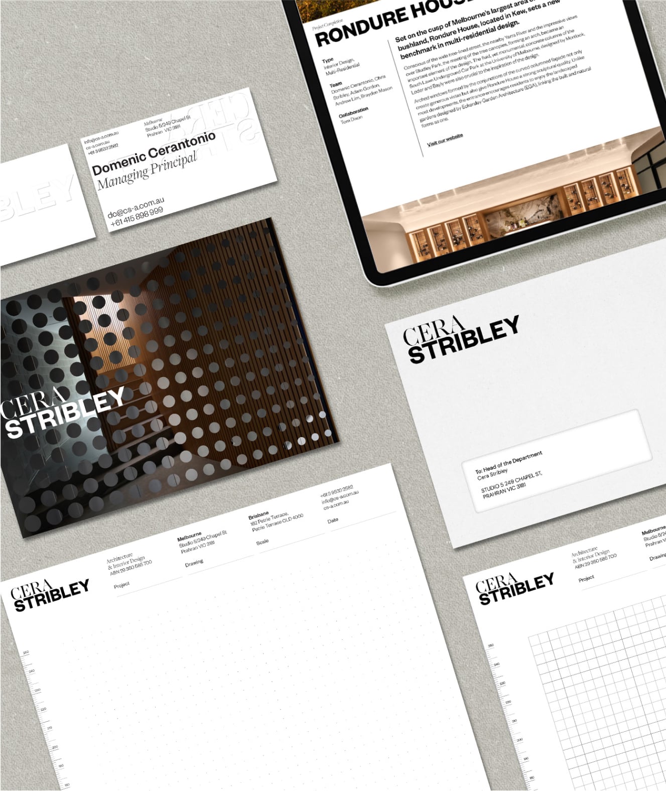
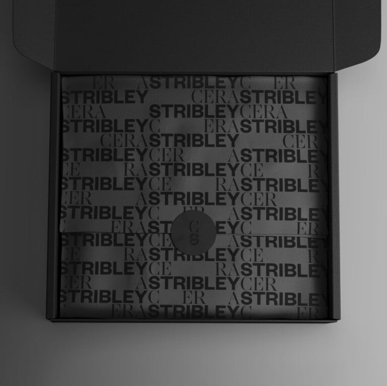
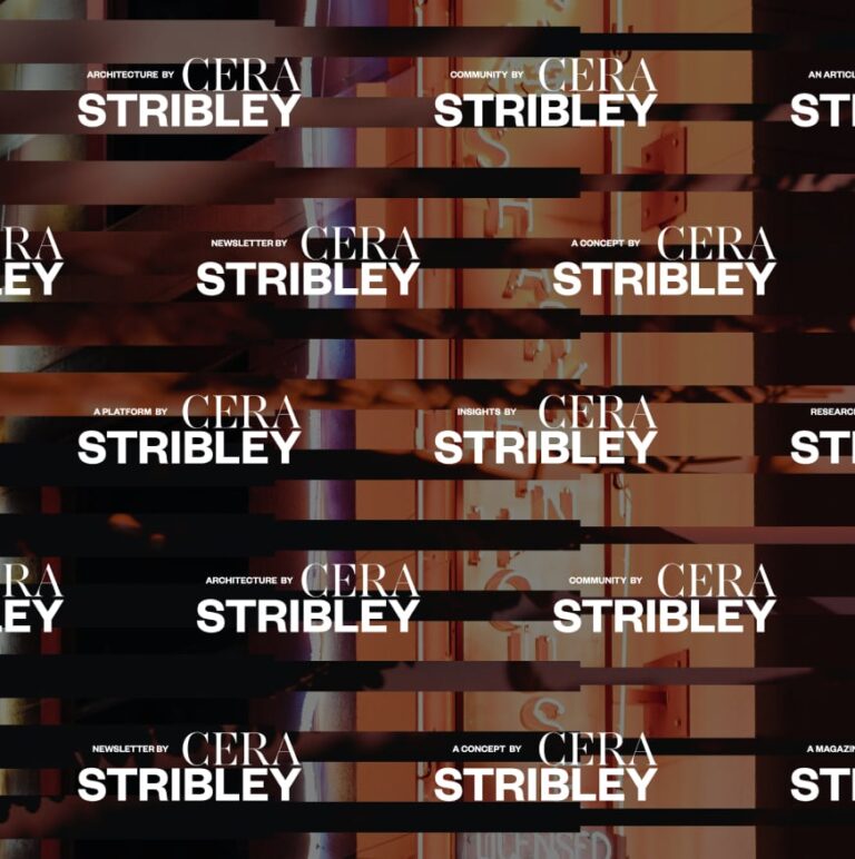
Cera Stribley is not driven by a ‘house-style’. They adapt and evolve to what the vision or the brief needs to be. With this front of mind, we created a brand identity, which weaves in a new future focused narrative into the brand — Design in Dialogue. The brandmark is made up of two different styles of typefaces — an expression of how Cera Stribley approaches design and the constant conversation between different perspectives. We reflect the adaptability by creating a flexible logo that animates and changes to suite collateral, introducing fun and personality.
TEAM
-
Client
Cera Stribley
-
Branding
Studio White Noise (obviously)
Andreas Pranoto
Ross Karabelas
-
Architect & Interior Designers
Cera Stribley
-
Strategy
Marc Lyons
Domenic Cerantonio -
Copywriter
Weina Ha
Marc Lyons -
Web Developer
EFront Digital
-
Illustrator
Matthew Chan